Did you know we have an online conference about product design coming up? SPRINT will cover how designers and product owners can stay ahead of the curve in these unprecedented times.
“You never get a second chance to make a first impression.”
While getting people to visit a website is important, what businesses actually want is a conversion. In other words, grab fickle visitors who may be interested enough in the company’s unique value proposition to sign up, subscribe, stay updated, share with friends, and become loyal customers.
That being the case, a landing page designer’s primary goal is to create a high-converting landing page by making a strong first impression, and they have less than 7 seconds to do it.
When developing the visitor experience for landing pages that convert, landing page designers typically take different approaches based on a set of considerations. They must carefully factor in the industry and market vertical, the audience, and the minimum information needed to seal the conversion.
The following are some innovative and successful strategies to improve landing page conversion rates.

1. State your case
Sell a better life
Companies persuade people to visit their website through various marketing efforts. Firstly, they explain how their unique product or service can benefit a potential user. The first few lines of the pitch need to strike an emotional chord that elicits a possible solution to the visitor’s problem, and it needs to happen in less than 7 seconds.
[Read: How to avoid stereotypes when designing for global markets]
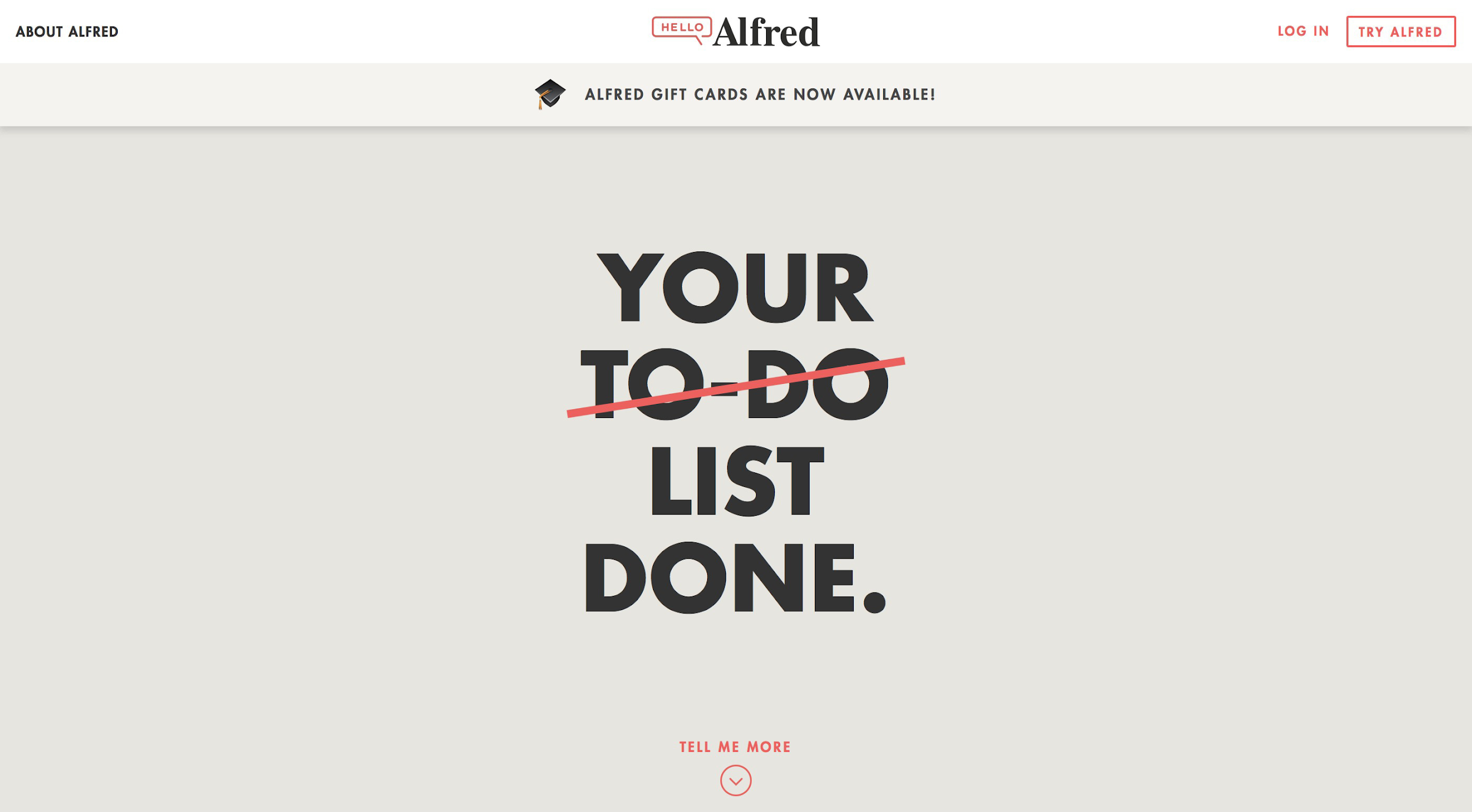
For example, rather than talking about the size of their customer base or how many contractors they have, the personal help and hospitality service Alfred tells visitors in just a few words how the service can help them get their free time back. The right language inspires prospects to envision how the offering can improve their lives. It’s a great sell.
Investment startup Betterment has a landing page that presents a convincing case to prospects. Harmonious colors, a smiling person, compelling copy, a unique value proposition, and a clear call-to-action (CTA) all help people immediately understand what Betterment has to offer.

Provide proof
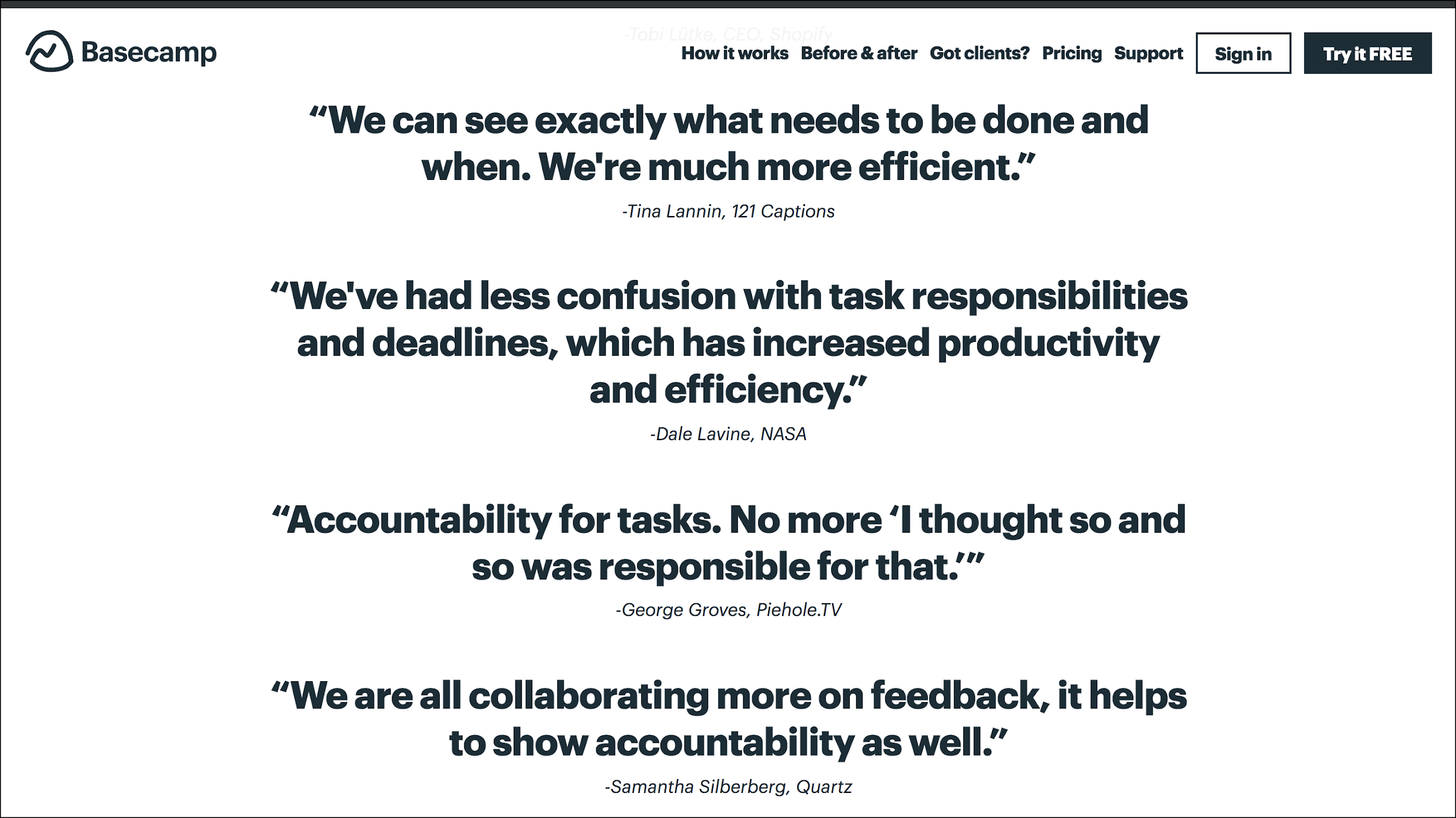
Another way to convert users is to highlight testimonials.
As Neil Patel explains, “It’s impossible to write copy as good as your customer. Why? Because good copy depends on the source, not just the style and substance. Testimonials are compelling because they show the customer what she will experience if she uses your product or service.”
Testimonials help sell the experience and visitors can easily internalize the possibilities.
Speak the visitor’s language
Striking the right mood for the right audience is also vital.
It’s important to match the language and visual design of the pitch to the emotion that is to be communicated to site visitors, whether it’s a sense of trust or flirting with danger, formality, or friendliness, stoic seriousness or cheek.
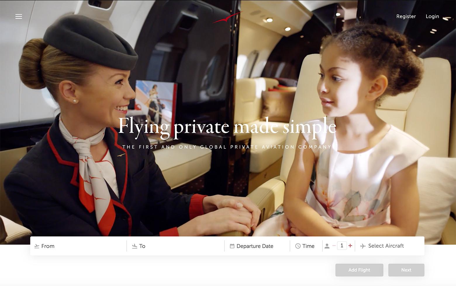
Tailor the message to customers. Here is a comparison of the language and imagery of two private jet services.
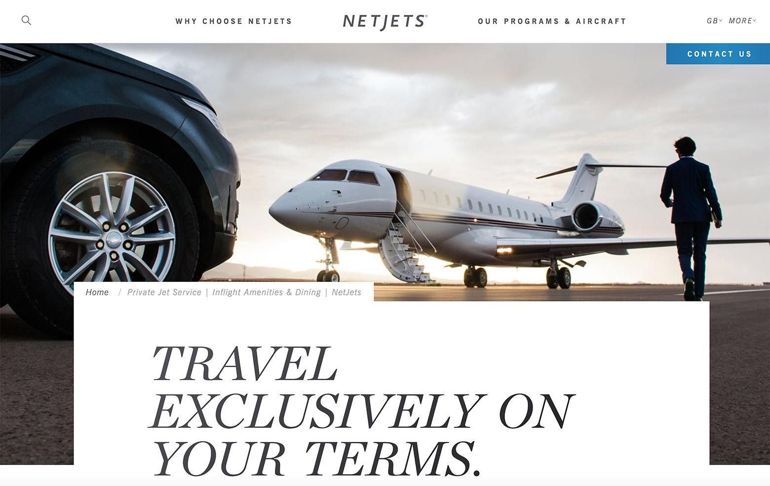
NetJets targets business people interested in luxury and exclusivity—feelings commonly associated with the idea of private air travel. On the other hand, VistaJet focuses on well-heeled families, making it sound like a completely natural fit for their life. The company’s offering is attempting to attract a core customer that fits a specific persona; hence, the landing page’s design conveys a mood and style that speaks to that target market’s sensibility, particular needs, and values.
2. Lead with action
Solve people’s problems straightaway
Designers need to ask themselves why people are visiting the site. To drive commitment from visitors is to focus on the primary action of the offering.
Airbnb’s landing page immediately communicates what it’s about—both with its headliner pitch and the form below it.
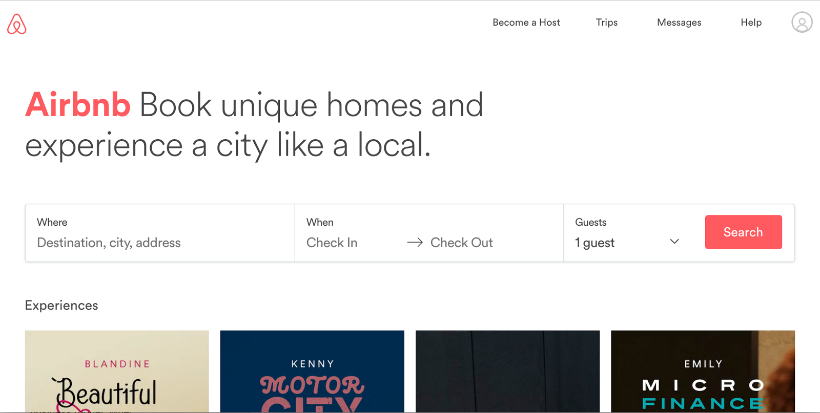
Designers sharpened the focus on the essentials of Airbnb’s service so that people can immediately start taking actions that escalate their commitment.
Once they’ve started planning their trip and exploring their options, they have invested time and emotion. It’s important to note that only after people decide to book or save a listing to their wishlist are they asked to sign up for an account.
This design simultaneously helps people complete their desired action (if they are committed to book) or can stimulate the desire to “save their work” (if they were exploring their options).
TaskRabbit does the same. Instead of the primary CTA asking visitors to “Sign Up,” they get to the heart of what people are after, which is “help around the home.”
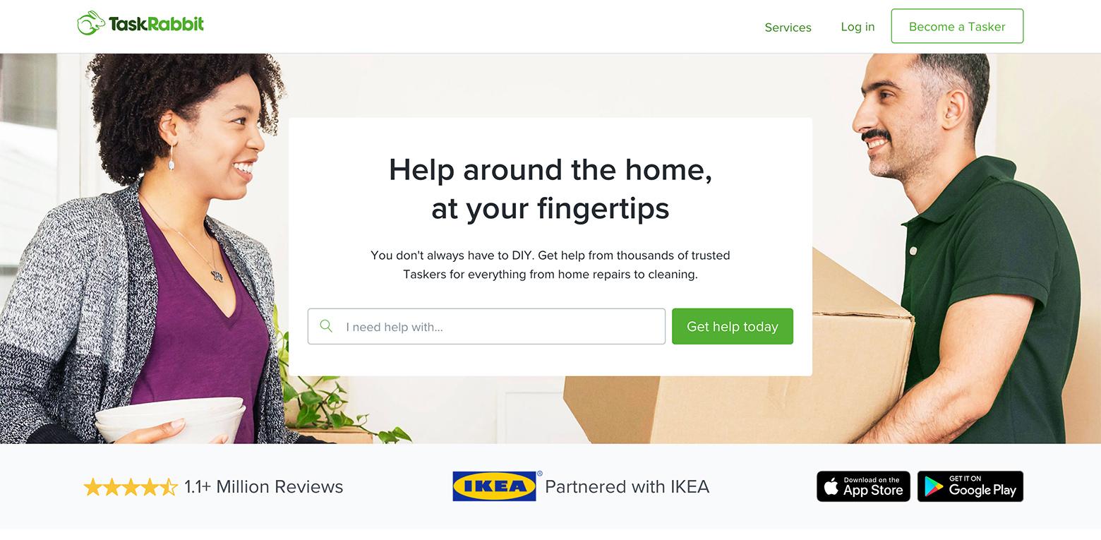
First, TaskRabbit strikes an emotional chord with the messaging and then presents an entry field asking people what they need help with. Merely reading the question prompts people to consider how they’d like to be helped and invites them to explore by stating their specific needs. This is immediate engagement.
3. Make them an offer they can’t refuse
Offer a discount
What the landing page offers may be a boon to visitors—the problem is, millions of other companies are already vying for the customer’s attention.
Sharing their email address can be a sensitive issue for some people, so landing page designers need to make it worth their while. It’s the reason why many companies offer shoppers an enticing deal just for handing over their email address.
Offering a discount, a free trial, free shipping, or any other compelling freebie incentivizes signups.
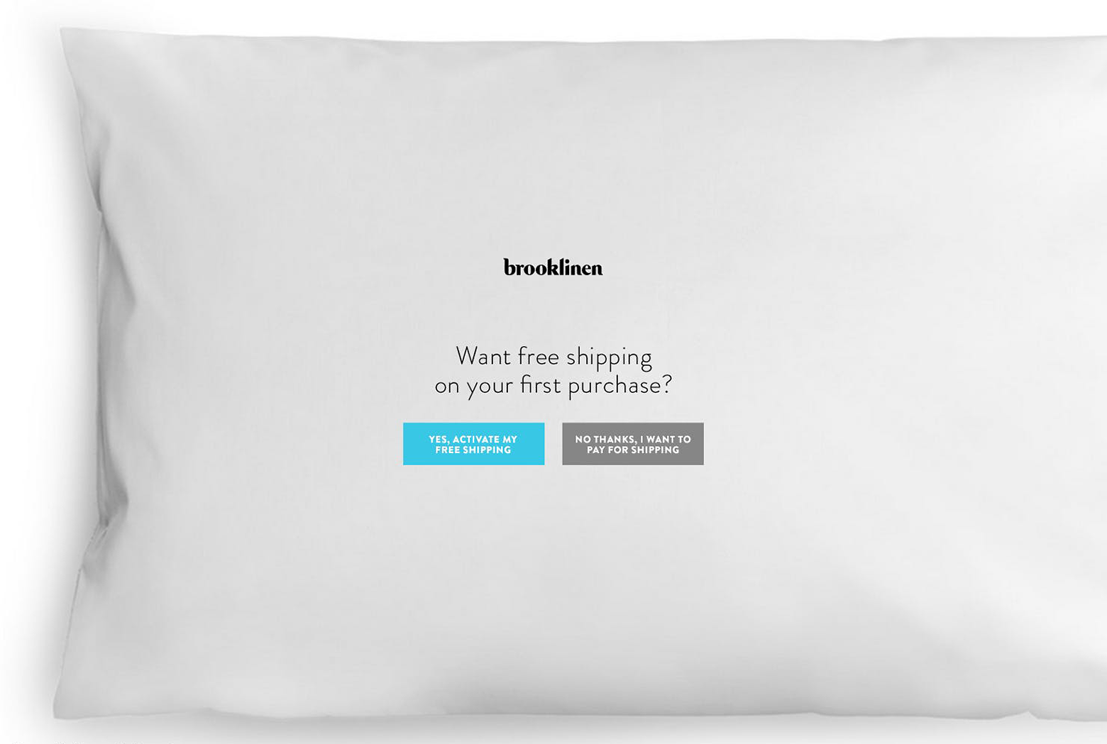
Take Brooklinen, for example. It offers its visitors free shipping on their first purchase. To continue to the site without a signup, people have to choose a button that says, “No thanks, I want to pay for shipping.” And who wants to pay for shipping?
Inform and educate visitors in a meaningful way
Another way to collect email addresses is to offer free content, such as an eBook, in exchange for an email address.
UXPin is known for its informative eBooks on a variety of topics. They give them away in exchange for the customer’s email address and a few nuggets of information. Visitors want valuable information, so they don’t mind providing their email address to get it.
Subsequently, UXPin can send emails to new subscribers to follow up with other enticing offers.

4. Reduce friction
Keep web forms simple
Many considerations can make or break a signup form; avoiding friction is one of them.
Friction is anything that stops people in their tracks, creates confusion, and requires too much cognitive work. The design may also be error-prone. The best forms contain helpful messages and clear labels, and they make it easy for people to digest information quickly.
People regularly make formatting errors with inline validation; it’s the designer’s job to make the process as simple as possible. Is it vital for people to confirm their email and password with additional entry fields? It would be better to give people the option to see a masked password.
Instapaper’s signup form is minimal and clean but doesn’t remind visitors why they’d want to create an account. The form also lacks inline validation, so people have to submit the form before finding out they didn’t enter a valid email address. This kind of friction may seem trivial but it can cost signups.

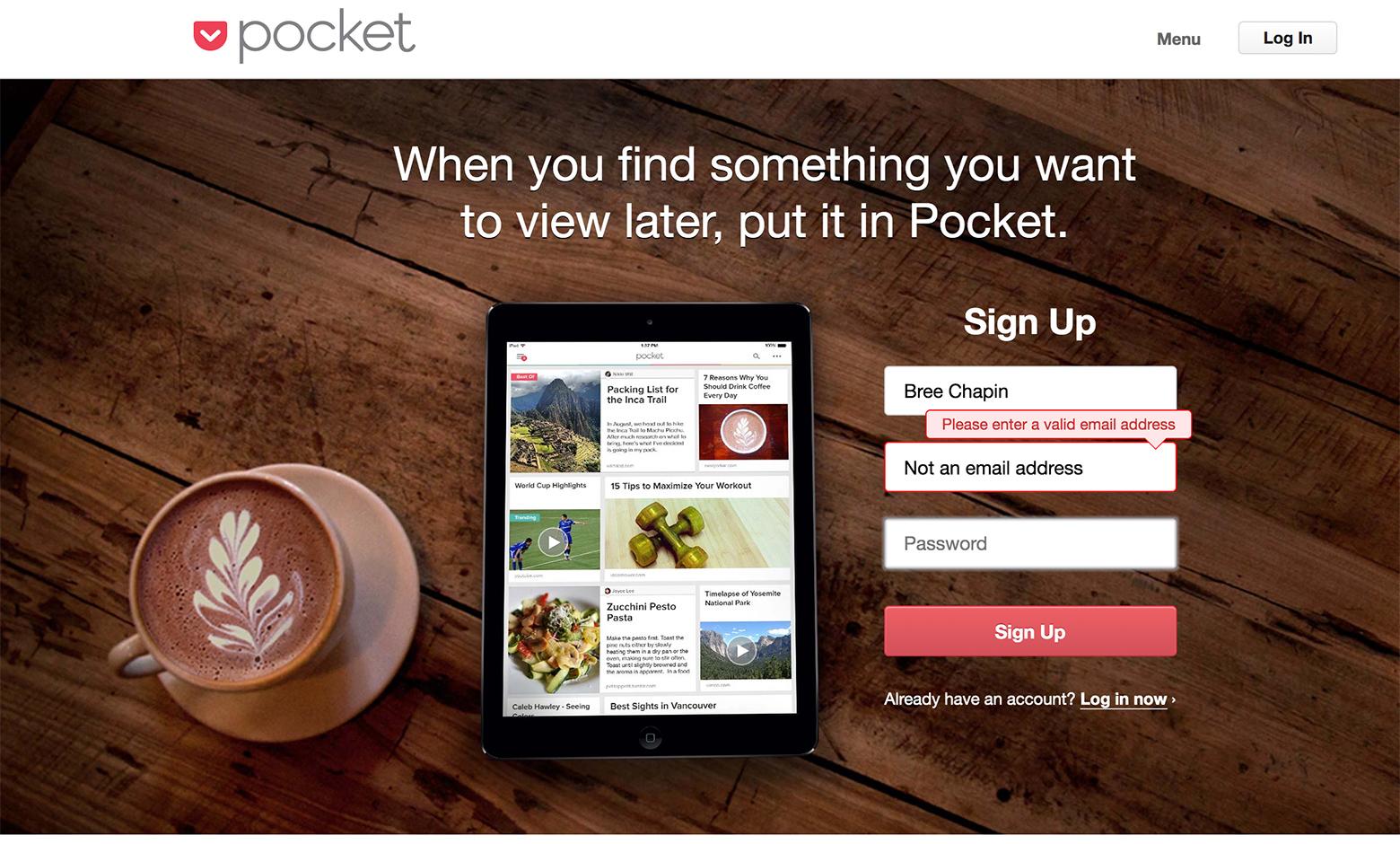
Quite the opposite, Pocket’s signup form is clean and inviting, and keeps the value proposition visible. The form is clear, and inline validation lets people know if they have made a mistake before submitting the form. People would rather see errors as they move through the process.
5. Mobile first
We’ve heard it a million times: mobile first. In 2016, mobile and tablet internet usage exceeded desktop for the first time.
Google search results favor mobile-friendly websites, which means it’s likely that first-time visitors are viewing a website on their mobiles. If the landing page and the signup form are not displaying correctly on mobile, the site will likely lose many potential conversions.
It seems apparent, but even today, there are still way too many websites that are not mobile-friendly. Sometimes, a website will look good on a mobile device but the signup forms fall short. Other times, the fields and buttons are too tiny or the designer has chosen input methods that are cumbersome to use on mobile.
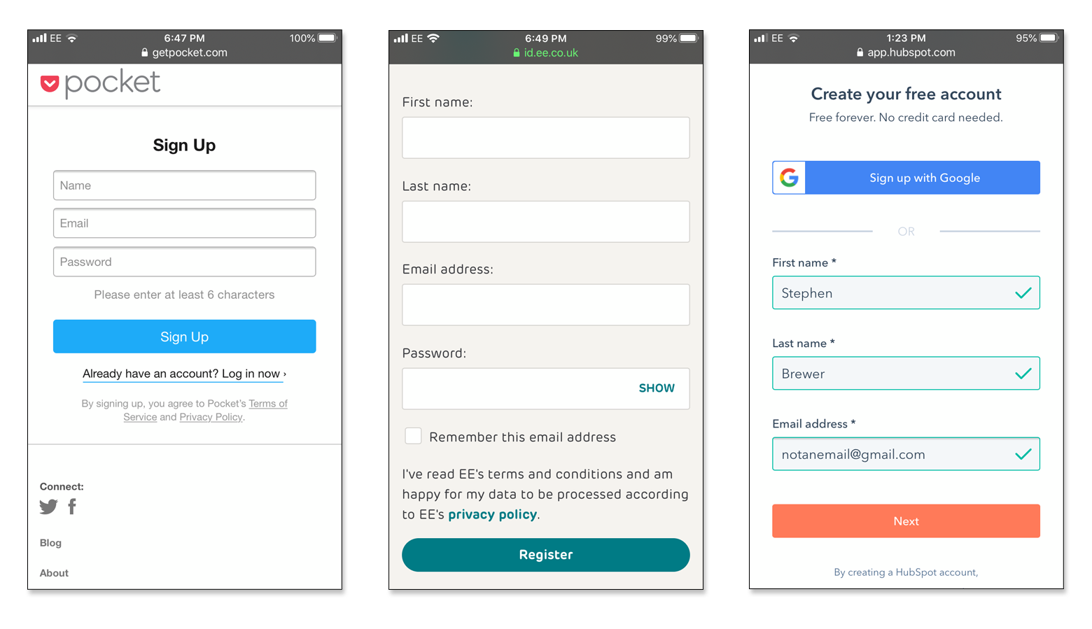
On the above mobile landing page signup forms, there is minimal noise and the clearly labeled fields are large and easily tappable. Buttons are clear and full-width. On most of these mobile form designs, the password field gives the user the option to show their password, which is excellent for mobile devices where typos and misfires are a fact of life.
6. Avoid too much information
Only ask for the bare minimum
Something all landing page designers need to consider: What is the bare minimum of information that businesses need to get people started?
If the first impression feels like an interrogation, potential conversions are likely to be scared off fast. Even if some fields are marked optional, asking for too much information will give visitors the impression that their privacy is not respected.
Macy’s, for example, asks too many questions to sign up.
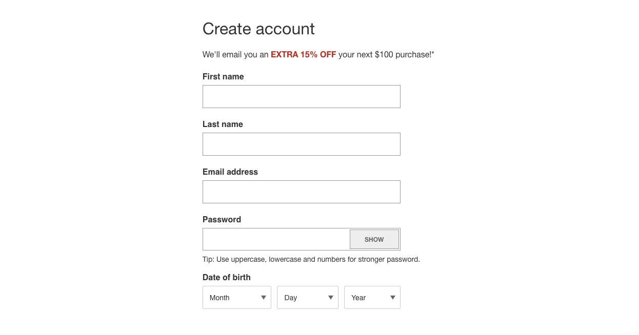
Why do they need to know a visitor’s birthdate? They probably want to know people’s age so they can segment them by demographic. It feels like an invasion of people’s privacy, so visitors would more than likely abandon the signup resulting in a lost opportunity. Information about age is something that can be entered later in account preferences.
And while TaskRabbit’s landing page is visually appealing, their signup form is also a bit too much.
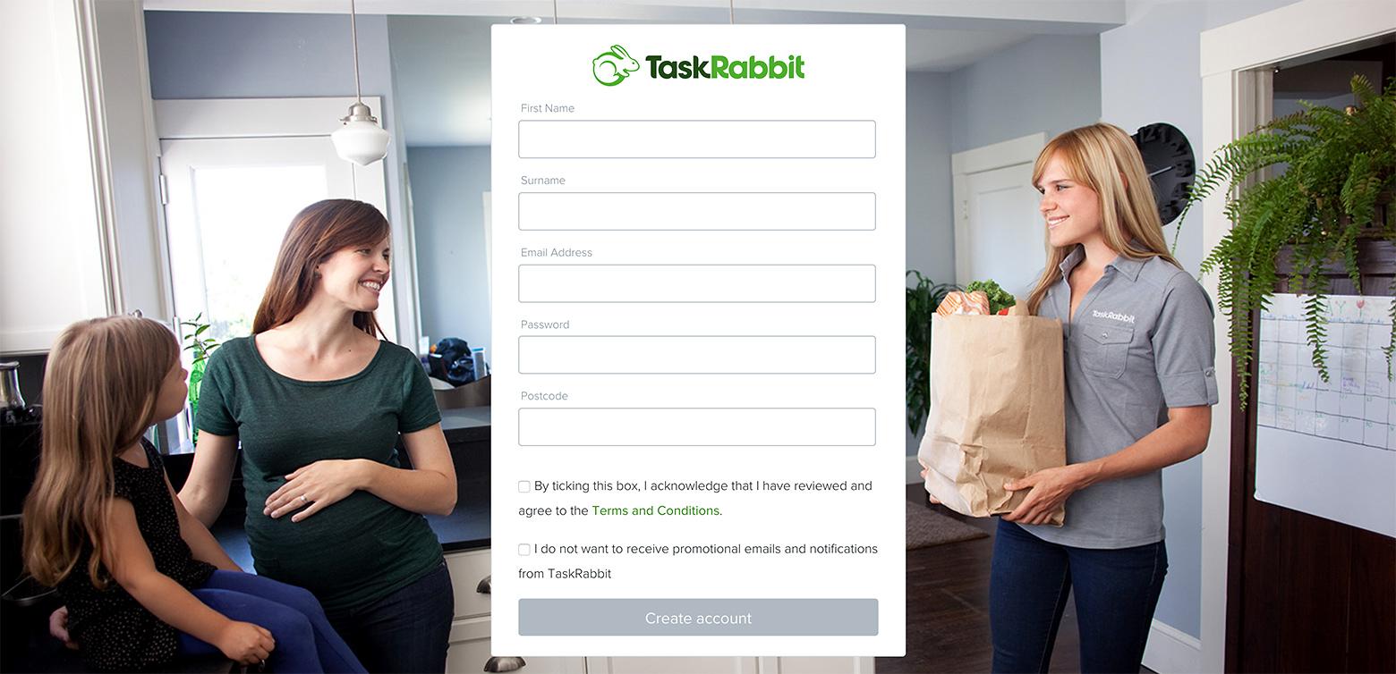
The postal code makes sense since service providers are local, but why do they need people’s first and last name to sign up for the service? Every extra field counts, and this is throwing roadblocks into a visitor’s path.
Landing page conversion best practices recommend that designers only ask for the bare minimum to get people started: an email and a password. Asking for first and last names and postal codes should be reserved for later during the onboarding process.
In contrast, Blue Apron’s meal kit service only asks people to create an account with an email address and password. Simple and quick. They don’t ask for a name or even a postal code—even though the service is not available everywhere—which means people are much less likely to abandon the form.

7. Start a conversation
Traditional landing page UIs with buttons, links, and forms are gradually disappearing behind one of the most intuitive and natural interaction patterns—the conversation.
The popularity of chatbots and conversational UIs is exploding. According to Gartner, chatbots will power 85% of all customer service interactions by 2020. In many cases, chatbots reduce landing page cost-per-leads (CPLs) by 48% and potentially double lead conversion rates by driving customer engagement.
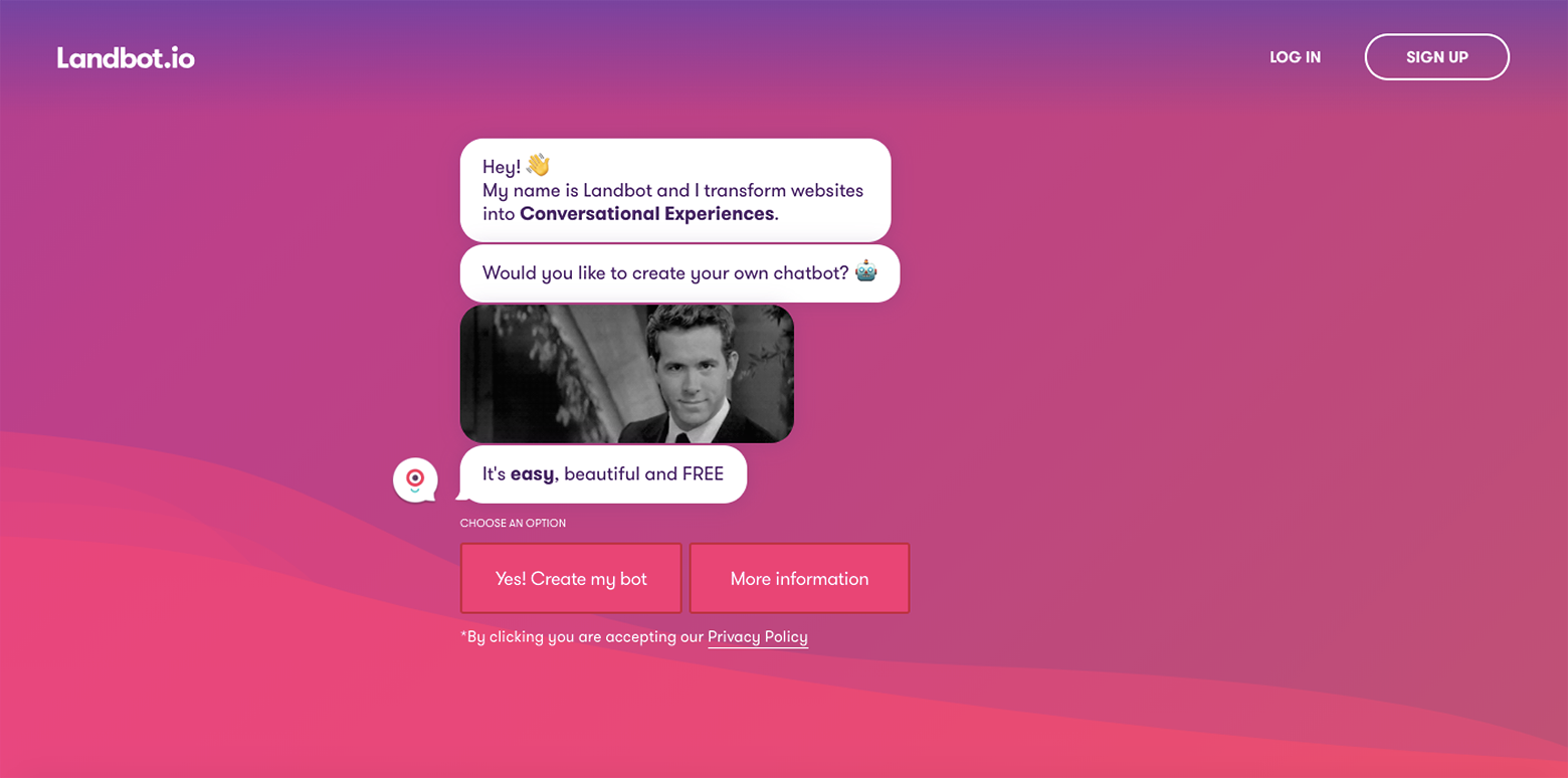
Conventional landing pages typically engage visitors with eye-catching visuals, animations, prominent value propositions, and carefully placed CTAs that are usually followed by a form. Chatbots, on the other hand, engage visitors immediately, can provide a more personalized service, and improve conversions many times over because they can generate and qualify leads.
If done right, conversational landing page UIs feel fun, friendly, and helpful and might work well for businesses hoping to foster a connection with their potential clients. This strategy might make sense for service industries, such as travel and insurance providers. By asking a series of questions, an AI-powered landing page chatbot can tailor its responses, and since speed is essential, quickly point the user in the right direction.
However, even very sophisticated machines still think like machines. If poorly executed, a chatbot can feel cold, and in the worst case, people might walk away feeling uncomfortable. It’s best to keep in mind that visitors are human beings who may have questions that run outside of pre-programmed responses, or that they may frame them in syntax the chatbot doesn’t immediately recognize.
While not right for every industry, conversational landing pages have the potential to engage visitors on a more human level. Since conversation is the bedrock of meaningful relationships, a chatbot must be capable of holding an intelligent, two-way conversation. The startups that take the leap and do conversational landing pages right will be true trailblazers.

How to design high-converting landing pages
There are millions of sites out there vying for people’s attention, and as discussed, designers only have a few seconds to convince a visitor to sign up for a product or service. Landing page designers need to think strategically about how and when to invite users to sign up, as well as what information to ask for, and at what stage.
People become interested in a product or service through exploration and engagement that drives their eventual commitment. To design landing pages that convert, it’s best to make the website appealing and effortless, and the signup process frictionless and pleasant. By following landing page conversion best practices, designers can develop high-converting landing pages that will bring in more customers.
The Toptal Design Blog is a hub for advanced design studies by professional designers in the Toptal network on all facets of digital design, ranging from detailed design tutorials to in-depth coverage of new design trends, tools, and techniques. You can read the original piece written by Bree Chapin here. Follow the Toptal Design Blog on Twitter, Dribbble, Behance, LinkedIn, Facebook, and Instagram.
Corona coverage
Read our daily coverage on how the tech industry is responding to the coronavirus and subscribe to our weekly newsletter Coronavirus in Context.
For tips and tricks on working remotely, check out our Growth Quarters articles here or follow us on Twitter.
