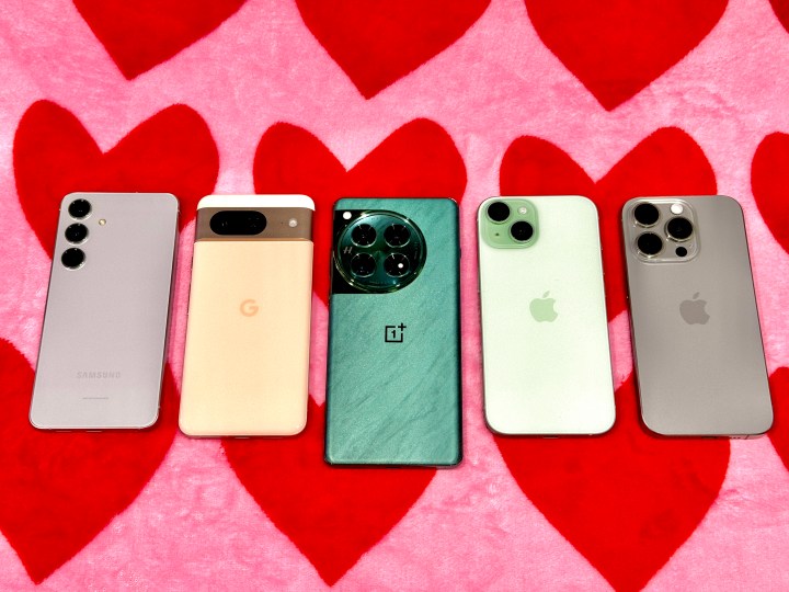
When you look at smartphones these days, the selection has grown a bit … stale, to say the least. You’ll see phones from top brands like Samsung, Apple, and even Google, but most options look the same — they’re glass slabs.
Samsung and Google also have their folding phones, adding variety to your phone choice, but Apple’s iPhones will always be slabs. The worst part is that most of these phones are also offered in some of the most boring colors lately, especially from Apple with the iPhone 15 Pro line. Which shade of gray do you prefer? That’s ultimately what it comes down to if you want Apple’s flagship smartphone.
Google and Samsung have done a bit better than Apple with the color choices, with the Bay Blue Pixel 8 Pro and Sandstone Orange of the Galaxy S24 But all of these brands have been using the same design for the past several years.
However, one smartphone brand has been standing out to me lately, and that’s OnePlus. Not only is the most recent OnePlus 12 a great overall phone, but it’s one of the prettiest ones I’ve used lately.
Make phone colors fun again
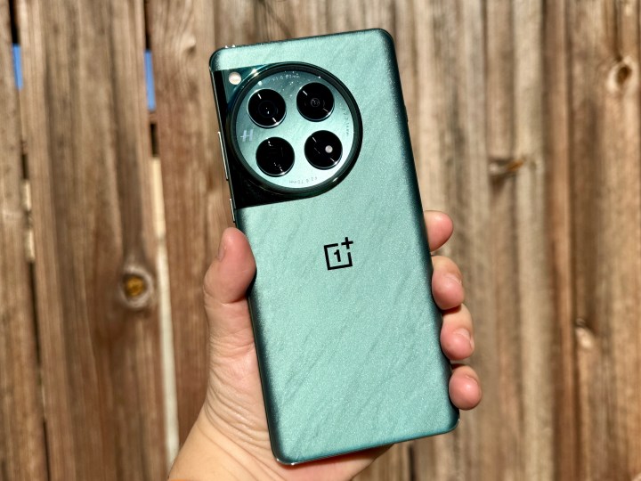
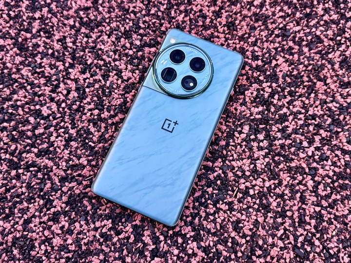
When I got the OnePlus 12, I was hoping to get the Flowy Emerald color because I’m tired of boring black phones. Luckily, I did get the emerald color sent my way, and though I may be a little biased (green is one of my favorite colors), I love everything about it.
Though the gorgeous white would have been my preference, that color was only available in China, so Flowy Emerald was my second choice. Like all colors, green may not be everyone’s cup of tea, but it shows that OnePlus at least takes a chance with something unique.
There’s a bit of backstory behind creating the Flowy Emerald color, according to OnePlus. It’s inspired by the Dart River in the Southern Alps, and OnePlus wanted to recreate those green ribbons that stretch across the land. Of course, OnePlus has a cheesy line about how you’ll “capture the true essence of time within nature” when holding the Flowy Emerald OnePlus 12, which I chuckled at, but there’s no doubt about it — Flowy Emerald is beautiful.

And it’s not just because it’s green, which is my second favorite color (pink is first). But OnePlus also added a gorgeous silver shimmer throughout the phone, even in the color-matched camera module, which really shines when light hits it at the right angle. This is definitely something you don’t see with other phone manufacturers, which not only offer boring, standard colors, but they’re also solid colors with either a matte or glossy finish.
Again, it’s not like Flowy Emerald will be a favorite for everyone. But at least OnePlus is taking a chance by creating some unique color offerings that truly stand out for its phones, unlike the competition. It wasn’t until I noticed the shimmer on the OnePlus 12 that I realized I needed more shimmery phones in my life. I love shimmer and glitter (as long as it doesn’t end up all over my hands). More of this, please!
Have we reached peak smartphone design?
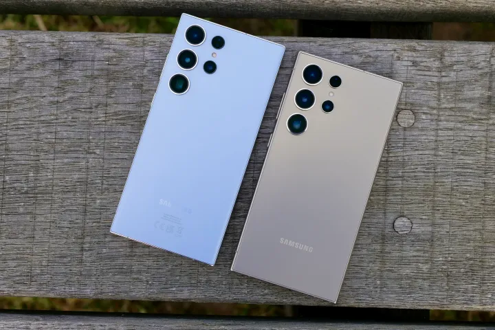
While colors are one thing, the overall design of smartphones has gotten boring and stale. Phones are either glass slabs, or a brand may do something a little more interesting with a foldable or flip phone, like the OnePlus Open or Motorola Razr Plus.
I know some people are quite vocal about not wanting Apple to enter the foldable phone market. I would have been one of those people, too, but since I’ve started diving into Android phones, I’ve found foldable phones to be fun to use, interesting, and something different. I would actually like to see Apple make a foldable iPhone one day.

Still, I miss when smartphone design was weird, gimmicky, or fun to use. Remember the T-Mobile Sidekick 3? That was one of my favorite devices before the iPhone came along, and I miss having something fun like that. I would love to see a modern-day implementation of that type of swivel-out screen.
OnePlus stands out to me as a brand that does things a bit differently, especially with the colors, and I love that. Even its first foldable phone, the OnePlus Open, was impressive in size and design, becoming one of my favorite foldables from 2023.
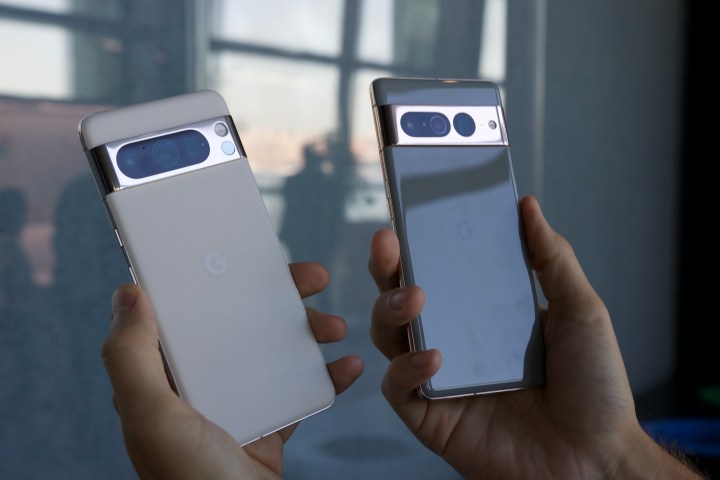
Apple used to be innovative with the iPhone, but it’s been the same overall look for the past four years. I’m definitely hoping for something more interesting with the iPhone 16 lineup, but I won’t hold my breath. And though I like the Samsung Galaxy S24, aside from the AI features and flat frame, it’s pretty much identical to the Galaxy S23 before it and looks too close to an iPhone with that flat frame.
I love tinkering with smartphones, but I’m just getting bored of the designs and, for the most part, colors. It feels like we’ve plateaued, and sometimes, it’s hard to be excited for a phone that looks just like last year’s.
Though OnePlus could use less cheese in their marketing about design inspirations, other brands could learn a lesson from OnePlus. At least put a little more effort into the design and colors instead of putting out the same boring thing year after year. Because when it’s done well, it makes a big difference.
Editors’ Recommendations
Services Marketplace – Listings, Bookings & Reviews
