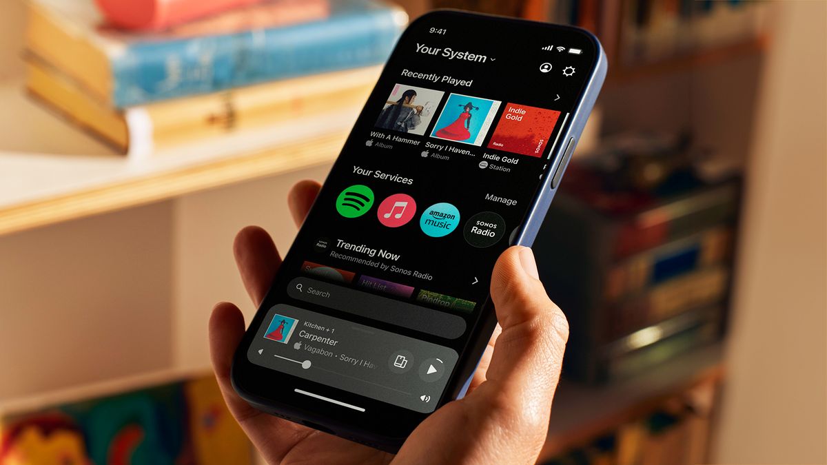
Sonos, maker of quality audio kit and some of the best wireless speakers out there, has released a new mobile app for connecting and controlling Sonos devices – but not everyone is happy with the change.
A large number of users are complaining about the new companion app, which was substantially redesigned after years of “extensive user research” and released to iOS and Android users on May 7 alongside a new browser application for desktop. App marketplaces have been flooded with one-star reviews since the new version dropped.
Here’s how Sonos’ social accounts describe the app: “A fresh look. Quicker access to your music. Easier control.” It’s meant to offer a simpler interface that’s more customizable to each user, offering something of a reset from previous versions of the app.
And here’s how a post on the Sonos subreddit with 700 upvotes describes it: “they royally screwed up.”
Sonos has since responded with an official statement to The Verge, from Maxime Bouvat-Merlin, chief product officer. “Redesigning the Sonos app is an ambitious undertaking that represents just how seriously we are committed to invention and re-invention … It takes courage to rebuild a brand’s core product from the ground up, and to do so knowing it may require taking a few steps back to ultimately leap into the future.”
The company has also reached out to members of r/Sonos subreddit, where most of the unhappy discussion has been happening (along with some in the TechRadar email inbox), to explain that feedback is being discussed internally and to solicit more feedback. “These team conversations have been tough, but ultimately very helpful in highlighting the features and functionality that are most important to you,” says community manager KeithFromSonos.
So, if you’re one of the people affected by the missing features (more on these below), be sure to take your opportunity to be heard (hopefully).
Back to basics
So, what went wrong? There are many reports of bugs and apps not loading properly, but the most common complaints appear to be about small missing features that people relied on, such as sleep timers, alarms and specific numbers for volume control – with users claiming they’re either well hidden or entirely absent from the app. (For what it’s worth, I couldn’t find them in my Android app. And this is my job.)
Given people use alarms to, you know, wake up on time and get to their jobs, this seems like a risky thing to remove suddenly as a feature in case someone was caught unawares.
The new app also doesn’t allow users to edit their song queue, which is such a core aspect of music streaming today that its absence is a little shocking – even if Sonos intends to add it back in later.
The redesign is certainly sleek, with all those rounded edges beloved of UI designers these days, and there’s a permanent ‘now playing’ menu, which takes up a notable portion of the screen. It’s worth noting that some users are happy, or less affected by certain features having changed, and Sonos’ aim of simplifying the UI, and bringing important information together at a single glance, is clear from the new software.
Releasing a new application is often fraught, and we live in a time when companies are pressured to release fast and improve through successive updates, rather than getting everything out the door in the first instance. However, when you already have a substantial user base who are used to an app and family of devices in a certain way, removing those features is unlikely to ever go down well.
It feels like a beta iteration of the app, with Sonos acknowledging that the limited feature set will be gradually added in the future. In the case of that message, screen reader support is another very significant feature to have left behind.
But the promise of future updates at some point are little consolation for people finding their home audio setup is suddenly dumber than before. We’ve reached out to Sonos for comment on what kind of timelines to expect for features to be added and will update you if more information comes through.
We recommend holding off on the update for now if you’re more than a casual user of your Sonos system, as there’s no way to undo it. (Perhaps Sonos could allow the previous S2 app to become available as a separate download – this would provide a great bridge while things get ironed out.) And if you have updated already, we recommend setting up an alarm somewhere else. However, the app does feature dark mode, so at least it’ll get you in the right frame of mind before bed.
You might also like…
Services Marketplace – Listings, Bookings & Reviews
