
I write about and review cutting edge tech products for a living, yet every time I pick up a new piece of hardware I always think about my toaster. Not because I’m obsessed with bread, but more that my toaster is designed for how humans actually use gadgets. I use my toaster every week, and it’s a constant reminder of how other products are often badly designed.
Most toasters are pretty simple, you drop one, maybe two pieces of bread inside the top, pull a lever, and a few minutes later your toast comes flying out as if it just woke up from a dough-induced nightmare. The results can vary widely, from a perfectly golden slice to a visit from the fire department. My toaster is a little different.
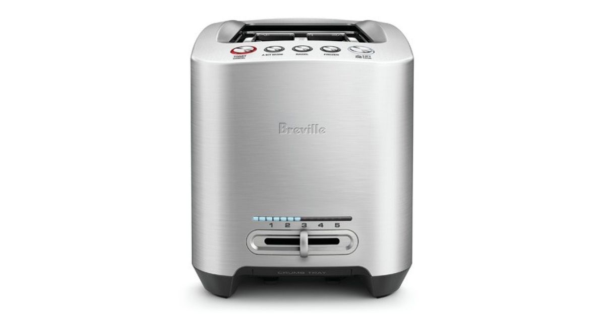
The designers have clearly thought about how humans actually want to toast bread, bagels, and crumpets (yes, it’s a weird British thing). There’s a setting for bagels that only turns on the inside sections of the heating elements so you don’t toast the outside. A frozen button also makes it easy to toast bread you’ve stored in the freezer. These are both useful additions, but the two buttons that really set it apart are “quick look” and “a bit more.” The quick look gradually lifts your toast or bagel to the top so you can check on its progress during the toasting phase. A bit more lowers it back down for more cooking time.
These two buttons, and their simple naming, are designed to reflect the messy reality of toasting bread, bagels, and other baked goods. Bread varies in thickness and density making it impossible for toaster presets to make a perfectly toasted slice every time. My toaster reflects the complex reality of life with a couple of buttons that are easy to understand and even easier to use.
Now I know my toaster isn’t perfect (even this model from 1948 had some great ideas) but I wish more tech products were designed with me in mind. Human-centric design has definitely progressed in recent years, but it’s still common to power on a device and be blasted with notifications, pointless questions, and a barrage of information overload that ultimately makes it more difficult to use. I often pick up a new gadget and question why the camera is placed in a certain location, or the buttons feel stiff or clunky, or why it’s still not using USB-C. Didn’t anyone try to use it?
I’m not a product designer, engineer, or even really a qualified expert on how hardware should be designed, but I definitely appreciate when a lot of thought and consideration has been put into how people use things on a daily basis. It often feels like half my job is nitpicking, but these small product design choices hugely influence how we interact with technology every single day.
As we move increasingly to an era where devices are full of sensors and make smart decisions for you based on algorithms and machine learning, I hope that the trend of designing for humans first becomes ever more apparent. We’ve wasted too many years using bad thermostats, microwaves, ticket machines, ATMs, and other pieces of technology that could really benefit from a total overhaul. If everything worked like my toaster, life would get just a tiny bit less stressful.