Amazon’s been releasing and iterating on its Fire TV streaming device line for six years. Now it’s built into various TVs and sold in sticks and cubes. But one constant has remained: a bloated, ad-filled user interface that lags behind the competition.
Not anymore, though.
The rollout for what the company is calling the “new Fire TV Experience” has begun, with support coming to nearly all Fire TV products by early 2021 — with the exception of first-generation Fire TV and Fire TV Stick devices. Amazon’s stated goal is to make it faster and easier to find what you want to watch with a number of quality-of-life upgrades. I was able to test out the interface overhaul and am pleased to report it’s a noticeable upgrade, though not one without some kinks to iron out in the future.
The Good: Horizontal layout, live TV integration, profiles

The old interface.
Image: amazon

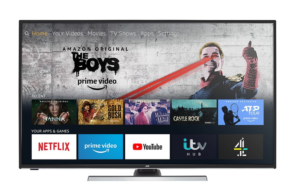
The new interface.
Image: amazon
Prior to this update, the Fire TV interface had a half-dozen tabs at the top of the screen for things like movies, TV shows, and apps. There was also a home screen that sort of vomited all of those things out together based mostly on what you had been watching recently, with ads for Prime Video shows and movies taking up a ton of space on the top half of the screen.
You’ll still get a scrolling selection of timely ads at the top of the screen now, but Amazon condensed everything else into just four tabs in the middle section: Library, Home, Find, and Live. Scrolling to any of these tabs will unfold their contents onto the bottom half of the screen. Directly to the right of these tabs is a customizable row of six apps, along with a button taking you to every app you have installed and another one for the settings menu.
Assuming you only ever need six apps for everything you watch, this is great. Your essentials will never be more than a couple of directional button presses away. Amazon also included something called “App Peeks” that will preview popular shows and movies within supported apps like Hulu and Netflix in the bottom area if you scroll over them in the main app bar. If you see the first The Lord of the Rings movie hanging out down below as you scroll past Hulu, just highlight it and you can start watching it straight from the main menu, for example.
The “Library” tab is pretty self-explanatory, as it’s where you go to find any movies or shows you’ve purchased digitally from Amazon. I have only ever bought John Wick Chapter 3 that way, so it’s nice to have a dedicated section just for when I want to see the cool fight in the knife museum from the beginning of that movie. (It’s called having priorities, folks.)
The “Find” tab is also straightforward, giving you ways to search through basic categories like movies and TV, and more specific ones like documentaries, sports, and so on. It should go without saying that you can also search using Alexa voice commands, which is always going to be faster than typing something out using a streaming remote.

The Find tab is simple to use.
Image: amazon
“Home” operates similarly to how it did before, giving you a smorgasbord of apps you’ve used recently, sponsored content, and recommendations based on your watch history. It’s still a little busy for my tastes. But the fact that you can get by without ever even looking at it thanks to the new app bar negates most of my complaints.
Finally, the “Live” tab bundles together whatever live subscriptions you log into on the Fire TV device so you don’t need to open those individual apps. For example, I logged into my Sling account so I can access a basic channel guide straight from the Fire TV menu and find something to watch without going through the effort of opening Sling. This is actually an improvement over my favorite streaming device and interface this year, the Chromecast with Google TV, as the live TV tab there only supports YouTube TV at the moment.
These are all smart improvements that hasten the process of getting to your shows and movies (or live sports, in my case), especially considering how slick and responsive the UI is overall. I experienced some noteworthy lag for maybe half an hour after setting up the Fire TV Stick Amazon provided for testing, but once I downloaded my apps and everything settled in, it became pretty breezy. That I was able to dart around the interface and find what I wanted largely without thinking about it is a high compliment.
One last improvement I’ll talk about is the addition of profiles. These work exactly as they do everywhere else: Each person who wants to use the Fire TV device in a household can make their own profile and customize the interface to their liking. While not strictly necessary, this will also ensure that you don’t get content recommendations based on things your dad watched. It’s small and probably overdue, but hey, we’ll take it.
WATCH: What to binge on the best 30-day free trials

The Bad: Small main app row, prominent SponCon
I don’t have a lot of gripes with the new Fire TV interface, but there are still a couple of things I wish were better.
First up is the omnipresent horizontal app row, which as I’ve previously stated is a great addition that speeds things up tremendously. Unfortunately, six slots just isn’t enough to work with depending on your individual needs. It’s probably easier if you’re not a sports fan, but my need to have ESPN and Fox Sports be quickly accessible means I really only have four slots for regular streaming services.
This is one of the areas where the Chromecast with Google TV still outpaces Fire TV. That device’s interface gives you at least twice that many home screen slots for its horizontal app row, so there’s no real comparison. That said, Amazon’s saving grace here is a section for apps you’ve used recently in the “Home” tab. If you’ve used anything that couldn’t fit in the app row, it’ll at least be fairly easy to get to that way.
Even that isn’t without problems, however. You have to scroll down past a sizable horizontal scroll of sponsored content in the “Home” tab to access your recent apps. Yes, you read that right: SponCon is given priority over something as basic as “here are the last few apps you used.” I don’t care if Red Bull paid Amazon to advertise Red Bull TV on my home screen! Put that somewhere else!
Aside from those two quibbles, I’ll give Amazon credit for a mostly intelligent Fire TV redesign that lets users cut to the chase faster than they could before. It’s cleaner and snappier than the old UI, and the addition of profiles will be a boon to multi-user households. I’d still probably recommend the new Chromecast with Google TV over this, but I can’t complain about the gap between the two being closer than it used to be.
[embedded content]