Rabbit R1
There’s barely anything worth testing on the R1 for now. It’s a half-baked device that needs way more work.
Pros
An eye-catching design
Body feels well-made and good for the price tag
Controls are intuitive and minimal
Cons
An unfinished product that barely offers anything exciting at the moment
Struggles with almost all of its current features
Extremely short battery life
I was pretty excited about my Rabbit R1 review unit and planned on checking it out for a whole week. My plans included using it outside around the city, inside of the house as an all-day companion, and playing around on it with my friends. Sadly, I quickly ran out of things to do on it. It barely offers anything worth testing at the moment.
Advertisement
Rabbit’s promises
In his keynote that came out around CES 2024, CEO Jesse Lyu promised the world with this device. He was adamant that we don’t think of it as a phone replacement but rather as a gadget that will complement the way we use our phones. According to its makers, the sole purpose of the R1 is to save time and maximize convenience by decreasing the number of taps on our phones.
Advertisement
The idea is for the R1 to establish a one-time connection with the services you regularly use and subsequently handle them for you—eliminating the need to use a different, dedicated app for each service on your phone. The R1 currently supports Spotify, Uber, DoorDash, and Midjourney. Rabbit’s ambitious about a future where we don’t have to navigate five different apps on our phone to carry out five different tasks. Instead, it wants the R1 to act like an automated personal agent of sorts. One that is able to fulfill (some of) our everyday tasks—hailing a ride, ordering food, playing music, more to come(?)—with simple voice commands.
Lyu also promoted the gadget as a quick standalone solution for getting things done, unlike our phones, where we’d often get distracted by a notification or the allure of social media and end up wasting half an hour on a three-minute task. An idea that has promise.
Advertisement
You can read the specifics of how it’s supposed to work here, but the idea is to go a step beyond the LLM (Large Language Model) that some apps have been deploying in recent months and introduce an LAM (Large Action Model). This means the R1 can do more than understand and respond to you; it can also execute actions for you, which is, in theory, supposed to make it more intelligent than the voice assistants on our phones.
Another feature that Lyu boasted about is the R1’s ability to understand natural language and filler words, which, according to him, gives it an edge over other AI chatbots. He also guaranteed and demoed context awareness—meaning users could ask follow-up questions on a topic. That all sounded interesting on paper.
Advertisement

For the price, the design and hardware are attractive
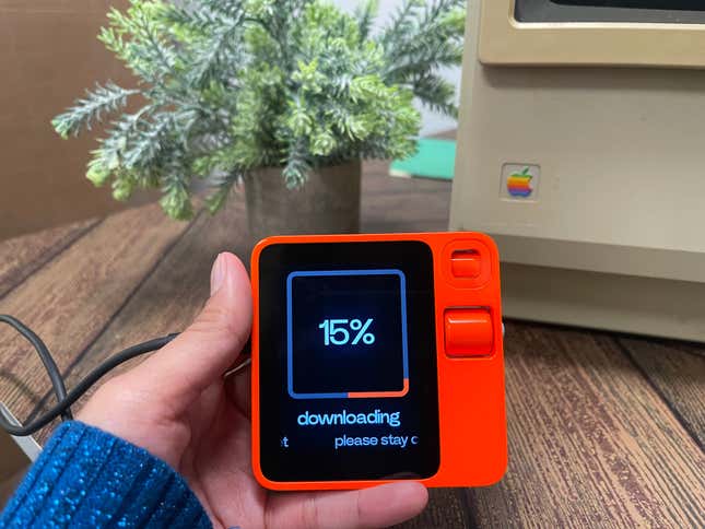
My favorite thing about the R1 is definitely how it looks. Designed by Teenage Engineering, the R1 sports a retro, old-school look that got all the ‘90s kids nostalgic. The general reaction from users online seems split on how they feel about the bright orange, though. Some are praising it, while others say it hurts their eyes. I agree it’s way brighter than it looked on screen, but I’m not complaining. I praised the recently launched bright yellow Nothing buds for their eye-catching color, and I feel the same way about the R1. I’m bored of tech being black, white, or silver.
Advertisement
In terms of the build, the R1 offers exactly what you’re paying for. Even though it’s all plastic, the body is well-made and feels pretty robust. It’s neither light enough to come off as flimsy nor too heavy to feel like a burden in your pocket. It’s sized perfectly well, too, and fits in my small jeans pocket easily. But don’t forget, your phone isn’t going away when you’re carrying this thing around.
The three-inch screen makes some users wish it were fully touch-enabled, but I like the current controls on the R1. In a time where everything from laptops to watches has a touch-screen, the R1 feels like a fresh breath of air and takes me back to the era of buttons and scroll wheels. However, you can tap on the screen while typing on the R1’s keyboard. For anything else, the display does not accept touch input.
Advertisement
I also appreciate how minimal and easily navigable the controls are. Just those two controls—the push-to-talk button (PTT button) and the scroll wheel—are responsible for everything on the device. For instance, the PTT button is pressed once to lock/unlock the R1, long-pressed to talk to it, and double-pressed to turn the Rabbit Eye on/off.
The R1 responds with sound effects and haptic feedback when activating its Vision feature or typing on its keyboard. Both of these outputs played their part in making the UX smooth and seamless. UI-wise, the R1 is almost there but falls short in one crucial area. When you’re talking to the device, the display shows an eager rabbit on the screen bouncing up and down with its ears propped up to show that it’s listening to you. As soon as you’re done talking, its ears go back down.
Advertisement
When using the Vision feature, the R1 will also tell you it’s working on your query to keep you in the loop on your query status. But when you’re talking to it outside of the Vision feature, it doesn’t provide status updates, which is strange and something I hope they add soon. If I was asking the chatbot a random question, I often ended up repeating myself only to find out it was actually working on my query and that I interrupted it, which meant I had to start over.

Advertisement
Everything else sucks
Reviewing the R1, I felt like I was using an empty orange box with nothing inside. Apart from its aesthetic qualities, this device has little to appreciate. All the features and functionality are promised for later this year.
Advertisement
I wrote a separate story diving deep into everything I hate about the R1, but here’s a summary: It’s an unfinished product. All that it currently offers is extremely bare-bones and nothing we can’t do on our phones. Sure, our phones (at the moment) aren’t capable of doing what the R1 could potentially do a year from now, so it probably should have been released a year from now.
It struggles with even the handful of services it’s offering at the moment. It often misunderstood my requests, acknowledged them but didn’t execute them, or ignored them. Uber “worked” on the second try but got both my pick-up and drop-off locations completely wrong the first time, and Uber is the last app I would want to risk my order on.
Advertisement
Spotify was a complete mess. It misunderstood song and artist names and failed to recognize my personal playlists even though I was logged in to my account.
Doordash did work, but the R1 is the last device I would use for that app. My food ordering process is rarely as simple as a single voice command. I need to browse through tons of options and prefer the six-inch screen on my phone for that.
Advertisement
Midjourney took me a day of troubleshooting with the folks at Rabbit to get it to work, and when it did, it was… Midjourney. I don’t see a point in generating images on this tiny handheld device when I can do that on my laptop in much better quality. The inclusion of Midjourney on this gadget doesn’t make a lot of sense to me. But if you really want to use your voice to generate random images on the go, you might be just the customer Rabbit is looking for.
The Vision feature was nothing special, either. It’s far less impressive than Google Lens at describing an object you’re pointing the camera at—and Google Lens is six years old. When it didn’t get my query completely wrong, it described it so vaguely that it wasn’t very useful.
Advertisement
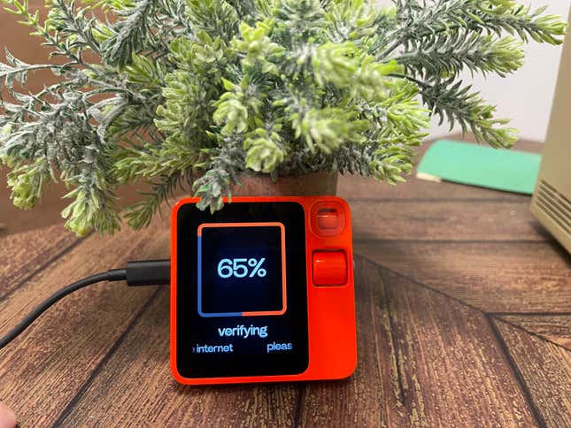
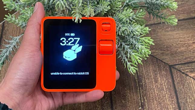
I also experienced unexplained connection drops with RabbitOS, which wasted a few seconds of my life every time I patiently waited for the R1 to sort its issues out and execute my command.
On top of all this, it features a surprisingly short battery life. The fact that a product marketed as an “all-day companion” doesn’t last more than five to six hours is almost comical.
Advertisement

Check back in a year before you buy this thing
The R1 needs way more work to be the next big thing, and Rabbit is on a tight deadline. It has already underwhelmed many users, and the company needs to work fast to deliver what they paid for. Rabbit also needs to work on what services it offers on the R1 and figure out a design for the app menu that makes sense for a three-inch handheld device.
Advertisement
I’m being generous with the two stars here. While it miserably failed at almost everything it set out to do, I feel the concept has some potential. It already has the design and build sorted out and is priced low enough that some people will be willing to take on the experiment. If Rabbit is quick enough to figure out the functionality it promised in the first place, it might be an exciting gadget.
Services Marketplace – Listings, Bookings & Reviews