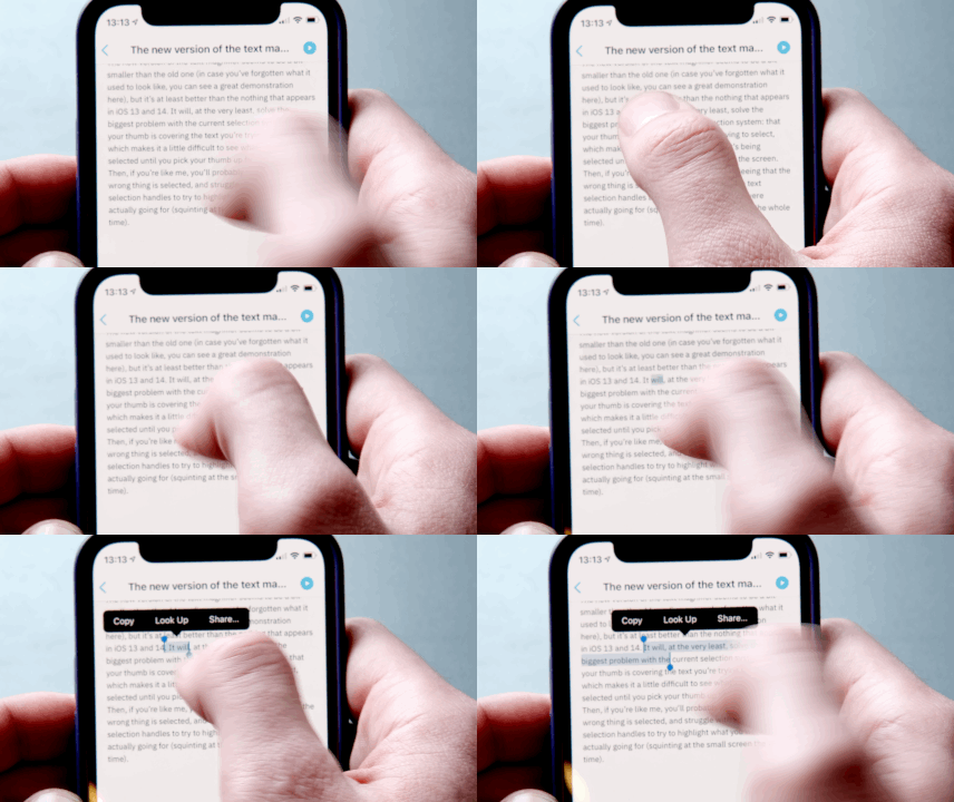
Apple’s text selection magnifying glass has reappeared in the iOS 15 beta, and Apple’s own site confirms its return by listing it as a feature. Bringing the feature back is a reversal from when Apple made the decision to dump it in iOS 13, which is a bit of a rare occurrence: Apple doesn’t usually go back after it’s done away with something (bringing back scissor switches in its keyboards after years of butterfly switches is a notable exception). The return of the little pop-up is welcome, though: I can only speak for myself, but since iOS 13’s release, I’ve constantly been struggling without the helpful little magnifier.
The new version of the text magnifier seems to be a bit smaller than the old one (in case you’ve forgotten what it used to look like, you can see a great demonstration here), but it’s at least better than the nothing that appears in iOS 13 and 14.
:no_upscale()/cdn.vox-cdn.com/uploads/chorus_asset/file/22645890/Screen_Shot_2021_06_08_at_12.51.43_PM.png)
It will, at the very least, solve the biggest problem with the current selection system: that your thumb is covering the text you’re trying to select, which makes it a little difficult to see what’s being selected until you pick your thumb up from the screen. Then, if you’re like me, you’ll probably sigh seeing that the wrong thing is selected, then struggle with the text selection handles to try to highlight what you were actually going for (squinting at the small screen the whole time).

iOS 15 is currently in early beta, so anything we see now is subject to change — Apple could always make the magnifying glass more prominent based on feedback, if it seems like a lot of people are still struggling. While this feature isn’t quite enough for me to risk downloading the first developer beta, I think it may be what gets me to immediately grab the first public beta when it comes out.
