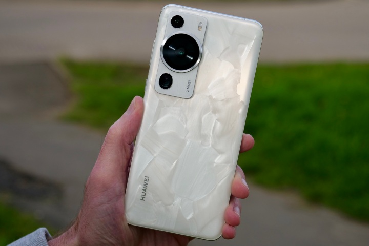
Apple, Samsung, and Google could all learn something from Huawei’s latest flagship smartphone, as it’s one of the best-looking, most ergonomic, and tantalizingly unique mobile devices I’ve seen and held in ages.
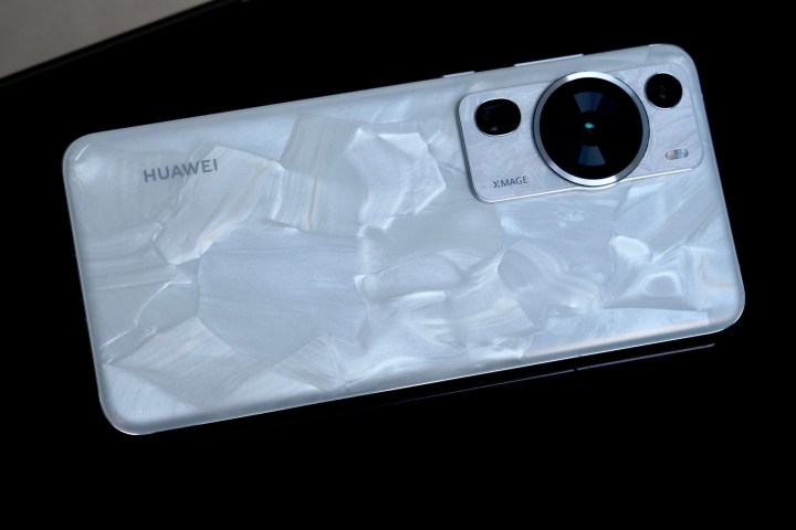
Above is the Huawei P60 Pro, and the stunning finish is called Rococo Pearl. Here’s what makes it special — and why I’d love to see other companies take such care.
A long history of great design
Huawei has a history of making its phones stand out through design as much as technology, and it was doing so when other phone makers considered making a white version of a phone quite daring. The 2018 P20 Pro’s Twilight color — which color-shifted between shades of blue and purple — led the charge, followed by several special versions in new colors, before the P30 Pro arrived the next year.
Amber Sunrise and Breathing Crystal were the chase colors, and both looked unlike anything else. Huawei later experimented with different finishes on the P30 Pro, combining polished and matte sections on a single piece of glass, and also used faux leather for a classier look on other devices. The P40 Pro used matte glass to great effect, and the recent P50 and P50 Pro were equally eye-catching in multiple different colors. The P50 Pocket folding phone’s textured gold finish made it look more like a piece of art than a phone.
Huawei never relegated its brightest, most vibrant color schemes to just its midrange and entry-level phones either, and its flagship phones came in exciting colors with unique finishes as well. There was always a boring black version, but it was never joined only by other muted, sensible tones. Whether it was marketing nonsense or not, there was usually an interesting design story behind many of its best creations too.
The P60 Pro in Rococo Pearl
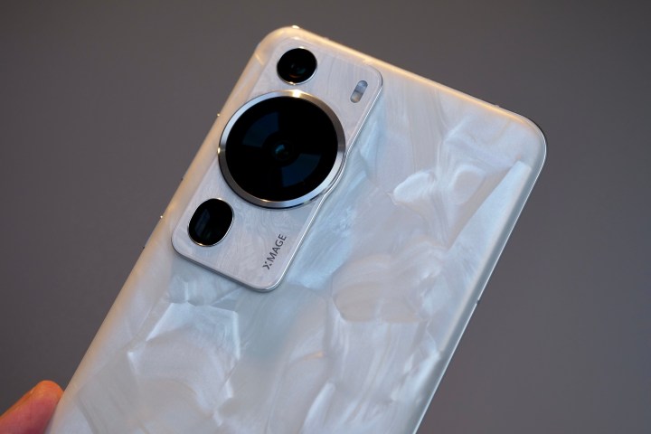
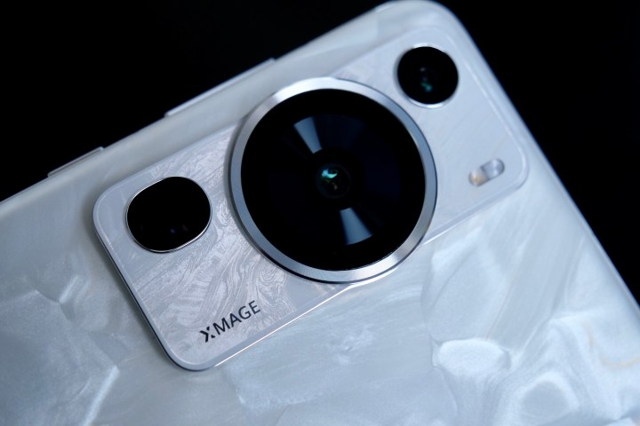
The P60 Pro comes in standard black, but when I tried the phone recently, I got to use the Rococo Pearl version — and it immediately made me swoon. It’s very far from being a basic white alternative, as it appears to have been created from the inside of an oyster shell. The phone has an incredible mother-of-pearl finish that has to be seen in person to fully appreciate because it’s hard to capture its beauty in photos.
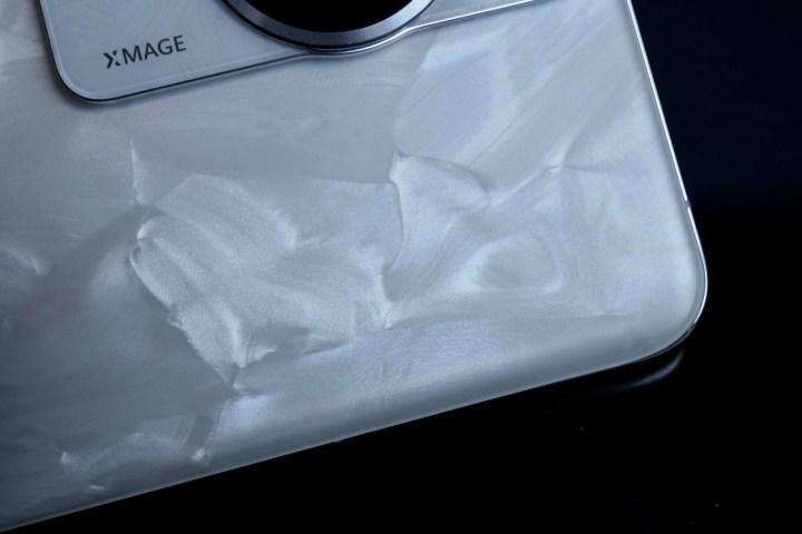
Despite looking like it has a texture, the finish is entirely smooth. The look is created using mineral pearl powder that’s left to agglomerate — meaning it all sticks together. This eventually becomes the unusual mother-of-pearl look, making each P60 Pro rear panel unique. It’s mostly white in color, but there are hints of blue, silver, cream, and areas of subtle gray tones too. It has a shape and visual texture to it.
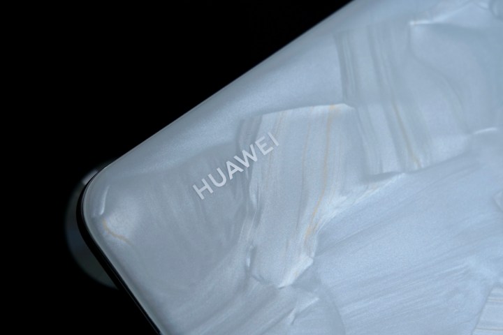
Huawei cites the shell of a Nautilus as inspiration for the mother-of-pearl design itself. The finish continues to the camera module, which has been cleverly designed with a transparent base to minimize its size and impact on the phone’s shape. The more you look, the more the pearl finish shifts and morphs in the light. The Rococo part of its name comes from a French 18th-century art style known for its elegance, curves, and subtle colors, making it rather apt.
Getting the ergonomics right
It’s not just the Rococo Pearl finish that makes the P60 Pro so interesting; it’s also the ergonomics. The flat-sided iPhone 14, which carries over the shape introduced (or should that be, reintroduced) with the iPhone 12, isn’t very pleasant to grip without a case. And while the Samsung Galaxy S23 Ultra is more shapely, the sharper corners mean it can dig into your palm. Considering it and the iPhone 14 Pro Max weigh more than 230 grams each, the shape and ergonomic design really matter.
The P60 Pro continues the “quad-curve” screen glass introduced on the P40 series, where the sides, top, and bottom of the glass all have a subtle curve, as does each corner. It’s genuinely special to hold, and the lack of sharpness or harsh, hard edges make for an immensely comfortable and friendly feeling in your hand.
It’s a little slippery, but Huawei says its Kunlun glass will survive a facedown drop onto a hard surface from 1.5 meters, giving some peace of mind. Even though the P60 Pro has a 6.67-inch screen, a fancy rear panel, and a metal chassis, it’s impressive that it only weighs 200 grams and is 8.3mm thick.
Showing others the way
Huawei’s dedication to design and ergonomics makes it special among smartphone makers. I’m not saying all other phones are hideous trolls by comparison, but many can look a little bland. And when you hold a phone as well -esigned as the P60 Pro, the shortcomings of others become more obvious. We’ve also been impressed by the P60 Pro’s camera, another area where Huawei has historically performed really well.
Tthe design isn’t perfect. The camera module and its layout are awkward, the mix of shapes makes it appear gawky, and the overall form factor of the P60 Pro isn’t all that different from the P50 Pro or even the P40 Pro. Outside of the Rococo Pearl finish, Huawei isn’t exactly pushing any boundaries here. It’s not ugly, but it’s not new either.
The P60 Pro has other problems, too, not least of which are the price of the phone and its lack of Google Mobile Services. These aren’t aspects easily forgiven and can’t be overcome purely by a pretty finish. But I’m exceptionally pleased Huawei hasn’t lost its creative streak while it deals with other business challenges. Although it can’t always compete on the tech and software side these days, it’s still showing the competition the way with design.
Editors’ Recommendations
Services Marketplace – Listings, Bookings & Reviews
