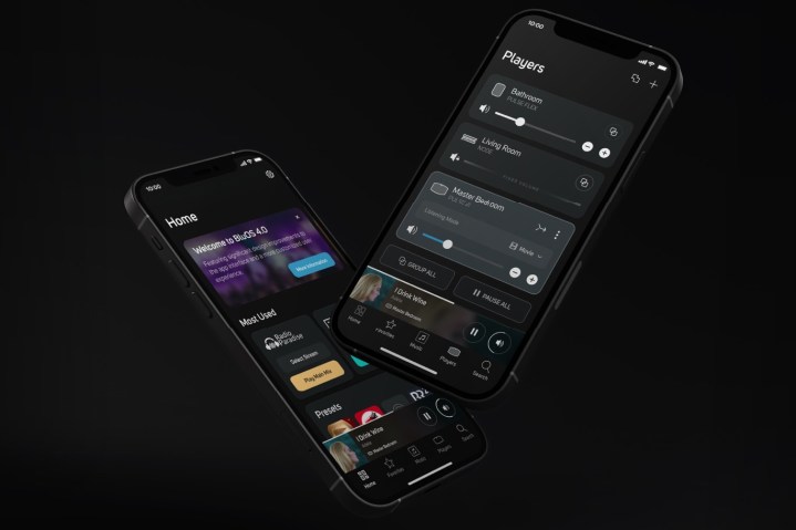
Lenbrook International, the company that creates BluOS, says that the software is going to get a major update in the spring, to version 4.0. BluOS controls wireless speakers from Bluesound, as well as a variety of audio gear from NAD, Dali, and PSB. The change will bring a cleaner look to the interface, as well as several enhancements to how the app works.
“BluOS 4.0 brings added depth to personalized, multiroom hi-res listening,” said Andrew Haines, BluOS product manager, in an emailed press release. “This comprehensive redesign of the mobile app interface reflects a commitment to delivering seamless user experiences for BluOS users.”

The biggest change in BluOS 4.0 is the home screen. A new tile-based layout provides easier access to your most frequently listened-to stations, music selections, recently played songs, services, news, updates, and more. It brings BluOS in line with apps like Sonos, Apple Music, and Tidal, which also favor tiles on their home pages for easy access.

Speaking of search, it’s not only accessible from anywhere in the app now that it’s in the bottom bar, but it also defaults to your last-used music service, which should make it faster to find what you’re looking for. If you only have a single music service set up, the search function will default to it. If you have multiple services, it will default to the one that was last browsed.
When browsing, a “+” button on the top right will directly lead to the Music Services tab, making it quicker to switch, manage and control streaming services.
If your favorite music services support favorites, adding to or removing them can now be done with one click by using the “star” icon in the top-right corner of the Albums & Playlists page.
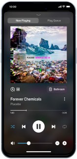
Getting to your available players (like Bluesound Pulse M or Pulse Soundbar 2i) in the Player Drawer will be directly accessible with one click from the Now Playing screen. Also new for the Now Playing screen is a toggle that lets you switch quickly between Now Playing and your Play Queue. A quality indicator lets you toggle between basic and detailed information.
Editors’ Recommendations
Services Marketplace – Listings, Bookings & Reviews
