COVID-19 vaccines are here. Now we just have to get them to people.
So far, several COVID-19 vaccines have been approved around the word. Thanks to a worldwide research effort spurred by a global public health crisis, no vaccine has ever been developed so quickly. But as the vaccine development effort goes on, the world now faces another challenge: actually getting those vaccines to the people who need them. So, how’s that going?
Well, it’s complicated. Fortunately, Our World in Data, a data visualization project based out of University of Oxford, has you covered. The project collects data on a variety of measures of the COVID-19 crisis, like cases, death, and hospitalizations, but its newest set, started in mid-December, provides a whole host of fascinating vaccination data in stunning clarity and detail. It’s drawn from public data collected by a variety of government sources and presented in different forms, from maps to bar charts to line graphs.
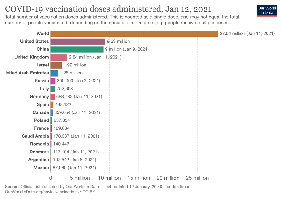
The data can of course give you numbers that you may have heard — roughly 9 million total doses of the vaccine administered in the United States, for example. But it can also show that we’re almost neck and neck with China, or how few doses of the vaccine the United Kingdom has administered compared to us (about 2.7 million).

Image: our world in data
The number of vaccinations alone can be misleading, since there’s a huge variation in countries’ populations, and therefore how many people must get vaccinated. So the data that the site provides on vaccinations per 100 people might be more useful. This would be a percent of the population vaccinated if each person got one dose, but because the vaccines mostly require two doses, it’s not that simple. But the numbers still show how well a country is doing; Israel, for instance, has given over 20 vaccine doses for every 100 residents. The other countries furthest ahead in vaccinations per 100 people also have small populations, like the United Arab Emirates and Bahrain. The UK is right ahead of the U.S. Our World in Data also recently added data for a few countries on how many people have received at least one vaccine dose, both in total and a true percentage of the population. But so far it’s almost identical, since so few people have received a second dose.

Image: our world in data
Then there’s daily vaccinations. Right now, the U.S. leads the world, giving over 600,000 shots every day, shortly followed, once again, by China. But you can also see another rate — daily vaccinations per 100 people. Despite the hundreds of thousands of people vaccinated daily, the U.S. gives just 0.2 doses for every 100 people. Clearly, we have a long way to go.

Image: our world in data
Other countries are facing a far more uphill battle. Countries like Mexico and Chile, for instance, have vaccinated a minuscule percentage of their populations, and Guinea has barely given enough vaccine doses to register. China leads the world in vaccine doses but hasn’t vaccinated much of its vast population. It’s also obvious how much of the data is missing. Almost all of Africa is blank on the page’s maps, and much of South America also has no numbers yet. Even India has no data, although the country has approved two vaccines and has many densely populated areas.

Image: our world in data
Of course, the world is only in the very beginning stages of vaccination. A map at the bottom of the page shows that almost every country represented is vaccinating only its most vulnerable residents, like healthcare workers and older people. But the data also makes it clear how far we’ve come. You can drag a simple bar at the bottom of each graph and go back in time, watching worldwide vaccinations shoot up from 1.5 million in mid-December to the over 28 million doses today, just a month later. We have a long road ahead, but as these charts show us, we’re on our way.
WATCH: What you need to know about the COVID-19 vaccine

