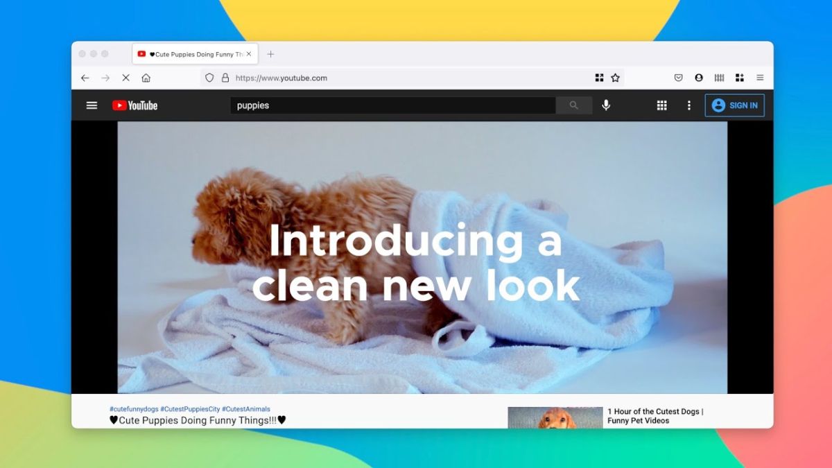
As more of our work is done in a browser than ever before, Mozilla has completely redesigned Firefox to provide users with a safer, calmer and more useful experience online.
The company’s all-new browser features simplified navigation, streamlined and clutter-free menus, new tabs designed to inspire productivity and less frequent notifications to ensure users have a fresh new web experience every time they use Firefox. All of these changes are designed to make it easier for users to focus on their frequently used items while being able to easily get to where they need to go to online.
Using video conferencing software such as Google Meet will also now be easier in Firefox as Mozilla has simplified its camera and microphone prompts so that users can get to all of their web calls and meetings with fewer clicks.
In terms of privacy protections, Mozilla has extended its Total Cookie Protection to Private Browsing mode so that users can rest easy knowing cookies aren’t tracking them across the web as the browser creates a separate cookie jar for each website they visit.
17 billion clicks
Before redesigning Firefox, Mozilla first took a closer look at where people were spending their time in its browser. The company’s engineers did this by observing clicks in Firefox for a month to discover that of the 17bn clicks that occur each month, 43 percent are on the Tab Bar, about 33 percent are on the Navigation Bar and about five percent are on the Bookmark bar.
They also took a close look at Firefox’s three menus (the right-click menu, the meatball menu and the hamburger menu) to see which ones users preferred. The right-click menu and the three parallel lines menu (hamburger) to the right of the address bar were the most popular which is why Mozilla has eliminated the meatball menu (three dots at the end of the address bar) from its redesign.
SVP of Firefox at Mozilla, Selena Deckelmann provided further insight on the browser’s all-new design in a blog post, saying:
“With these insights we wanted to create a place that felt fresh and modern, and kept things like icons and menus flowing in a cohesive way. This meant using simple design and easy-to-understand language to lessen people’s cognitive load, essentially getting them faster to the places they wanted to go. It also meant retiring intrusive alerts and messages to avoid a jarring experience and provide a more calming environment. Throughout this process, our extraordinary team of designers really thought about the colors and iconography and wanted to make them more refined and consistent. ”
Interested users can download the latest version of Firefox from Mozilla’s website for their desktop and mobile devices to test out the browser’s new look and feel for themselves.
