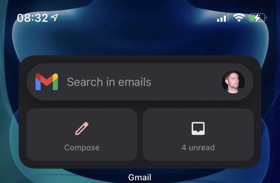
Gmail for iOS has been updated, with the biggest new feature being the ability to add a Gmail widget to your home screen.
I’ve tested it, and it works, but that’s pretty much all I can say about it.
For many of us, Gmail is a very important app, and having a widget that gives you an overview of your inbox at a glance sounds like a great idea. But the implementation of the widget on iOS just isn’t good enough to make it worth spending screen real estate on.
Unlike some other iOS widgets, the Gmail widget comes in only one size, and it cannot be customized. It has three features: it allows you to search through your emails, compose a new email, and it also shows you the number of unread emails; if you click on that, you’ll go to your inbox.

It’s nice to have a Gmail widget on an iPhone, but I’d like to see some more customization options.
Image: gmail
While this might be a good combo of features for some users, I find it sorely lacking. I don’t use the search function that much, I rarely just hit the “compose” button out of the blue (typically, I do it while browsing through my inbox), and I’d much rather see a list than just a number of unread emails. And I bet you’d set it up differently than me, but you can’t, because there are zero customization options. The only thing you can change, by long pressing on the widget, is the Gmail account it uses, which highlights another issue: You can’t have information from multiple accounts visible, you must choose one.
Consider that the plain old Gmail app icon can do most of this widget’s work already: It can display the number of unread emails (if you have notifications for it turned on), and you can get a compose button (for multiple accounts) by long-pressing on the icon. Sorry, widget, the icon pretty much has you beat.
In any case, having a Gmail widget is nicer than having no widget at all. Hopefully, Google will add some customization options in the future.
