Google has tweaked the appearance of the compose button in Gmail’s Android app. First spotted by 9to5Google, the old button, a small “floating action button” with a plus in it, is now an oblong button containing a pen icon along with the word “Compose.” It minimizes into its old circle shape when you scroll down your list of emails. Ultimately, though, I’d still argue that the bottom-right of the screen is a bad place for the app’s most important button.
I’m sure that Google’s floating compose buttons — which it uses across other G Suite apps like Drive and Docs — are the result of hours of testing that show that users easily find buttons when they’re positioned on the bottom right of the screen. I don’t doubt that there are objectively good reasons for them.
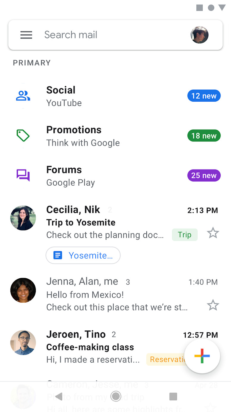
:no_upscale()/cdn.vox-cdn.com/uploads/chorus_asset/file/20020340/unnamed.png)
:no_upscale()/cdn.vox-cdn.com/uploads/chorus_asset/file/20020341/Screenshot_20200605_092546__2_.png)
But anecdotally? I forget the button’s there, especially since I prefer to compose new emails from my laptop, where Gmail’s web interface has the compose button on the top left. When I do need to write the occasional new email from my phone, my brain expects the compose button to be on the top of the screen with the rest of Gmail’s controls and my newest messages. As such, I find myself opening and scrolling fruitlessly through the Gmail app’s left-hand menu.
The bottom-right of the display is also where my thumb tends to hover when it’s not directly interacting with the screen, thus obscuring the button. I’m sure part of the appeal of putting a button there is that it’s within easy reach of your thumb (if you’re right-handed, that is), but for me it ends up having the opposite effect.
:no_upscale()/cdn.vox-cdn.com/uploads/chorus_asset/file/20020348/Screenshot_20200605_095603.png)
The floating action button is a key part of Google’s Material design guidelines, so unsurprisingly these buttons can be found across plenty of Android apps. Whether it’s Twitter, WhatsApp, OneNote, or ToDoist, most apps have their equivalent of their “create new” button on the bottom right of the screen. They’re pretty popular, so I’m prepared to admit that I’m the one with the problem here. But at least those apps use a solid block of contrasting colors to help the button pop off the display. Google, meanwhile, uses buttons with the same background color as the rest of the app, and relies heavily on a drop shadow to distinguish them.
All that said, I’m liking the subtle change Google has made to Gmail’s compose button so far. Not only is it more visible, but the animation of it transforming from an oblong into a small circle as you scroll also does a nice job of catching your eye. I won’t know if it’s solved my issues until the next time I have to hurriedly compose an email, but it seems like a step in the right direction. I just wish it wasn’t positioned in the last place I always think to look.