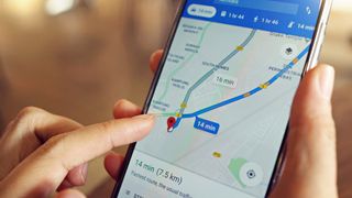
If you feel like there’s something slightly different about Google Maps at the moment, you’re not imagining it – Google has redesigned the pins used in Maps to highlight restaurants, beaches, and other attractions, giving many of them a new shape and set of colors. While the change is subtle, it’s hard to miss once you notice it.
Previously, pins on Google Maps would have a tall, narrow stem that came to a sharp point on the pinned location. The color of the pin, meanwhile, was uniform along its whole length. Now, though, that’s all changed. Pins are much shorter and come to a thick, rounded point at the bottom. Each pin uses a white background, with its icon sitting inside a colored circle within the pin itself.
This change brings pins in line with other Google Maps accoutrements, such as stars, flags and hearts. While they’re not quite the same – these elements are fully circular, without a pin shape on their bottom edges – they all now feature icons inside colored circles, with a white border around the outer edge. That makes the app a lot more uniform in terms of how its visual elements look – if anything, the old pin design stuck out like a sore thumb – although it might make it a little harder to distinguish pins from the other on-screen items, especially if you’re looking at a particularly busy area.
Elsewhere, some pin types have had their colors adjusted. Museums, for example, now come in purple instead of teal. Dropped pins – that is, ones you create yourself – were also still using the old, pointed design at the time of writing.
A small but noticeable tweak

This isn’t the only change Google has rolled out in recent weeks. At the end of July, the search giant changed the look of Google Maps’ bottom bar within the mobile app, removing a few items to present a simpler view. It’s also brought improved parking assistance to the app, as well as augmented reality views of historic landmarks.
And last year, Google Maps’ entire look got a major makeover, with new colors being used that broke with the long-standing color scheme of the app. That change proved to be divisive, with some users complaining that it made the app more difficult to use.
It’s unlikely that the new pin design will stir up quite so much ire, given that it only affects one small aspect of the experience. One reason for the change could be that it might allow Google Maps to fit more pins on the screen at once, as the new pin design is a touch more compact than the old look.
Since this appears to be a server-side change, you shouldn’t need to update your app to see the new pin design – just fire up Google Maps and take a look.
You might also like
Services Marketplace – Listings, Bookings & Reviews