
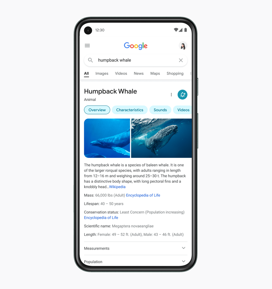
Google Search is getting a new, lighter, bubblier design for mobile devices. It’s rolling out “in the coming days.” Here’s what it looks like:
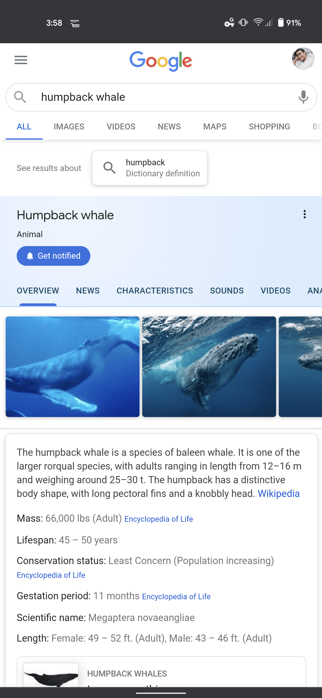
For reference, this is what the old search looked like:
Some of the changes include:
- A brighter design that allows people to focus on information “instead of the design elements around it.”
- Bolder text in search results, making it easier to distinguish between different types of information. This also includes using more of “Google’s own font.”
- Results are now edge-to-edge, rather than being framed in little cards with shadows. This gives results a little more room and eliminates some visual distraction
- Colors are used more purposefully, used to highlight certain types of information rather than distracting
- Everything is rounder for more of that Google-y vibe.
[Read More: ]
Okay, so it’s not the most radical redesign in the world. But if you were wondering why things look different next time you do a Google search, now you know why. For more on the changes, you can read Google’s post here.
Did you know we have a newsletter all about consumer tech? It’s called Plugged In – and you can subscribe to it right here.
Published January 22, 2021 — 22:01 UTC