Google knows your eyes need a break.
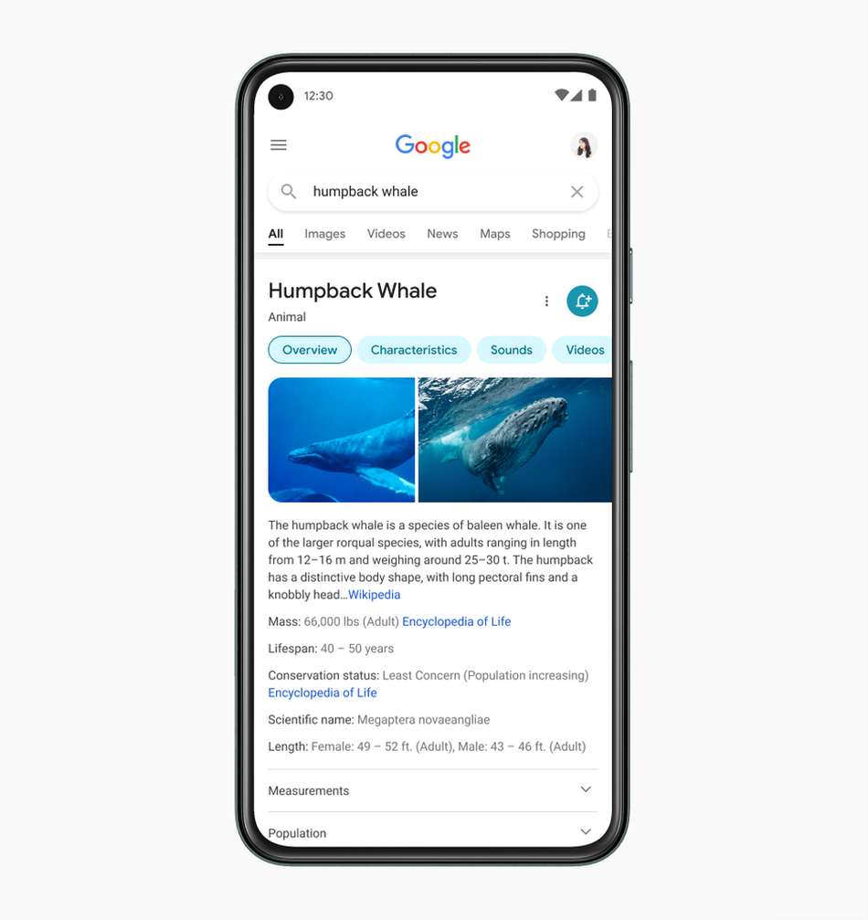
The notoriously data–hungry behemoth announced Friday an upcoming redesign of its mobile search page that will, among other changes, include larger and bolder text. The shocking premise is that the change, in addition to several others laid out in a Google press release, will make Google’s mobile search easier to use.
“One way the team [made text easier to read] was by using larger, bolder text, so the human eye can scan and understand Search results faster,” explains Google’s announcement.

Big text for a big whale.
Image: google
Brilliant.
According to Google designer Aileen Chen, who led the redesign, this change won’t be limited to just the results section.
“We’re making the result and section titles bigger, as well,” explained Aileen.

Running to boldness.
Image: google
Other changes include: a “new edge-to-edge results design,” “centering content and images against a clean background,” and “rounded icons and imagery.”
The changes are scheduled to hit users phones “in the coming days,” so keep your eyes out for that new look.
