Subways have never been my favorite mode of transit, but the onset of the pandemic made them even less appealing. Sixteen months later, Google Maps may finally have found a way to lure me back underground.
The service is now piloting the option to see live data on the crowdedness of individual train carriages.
Up front: Google initially launched transit crowdedness predictions in 2019, when people were more worried about finding a seat than catching a potentially fatal infection.
The feature uses a combination of AI, historical location trends, and user contributions to estimate the seating and standing capacity on buses, trains, and subways.
The predictions have now been expanded from nearly 200 cities to more than 10,000 transit agencies in 100 countries. In addition, Google is now piloting the ability to see live crowdedness information on individual carriages, so you can choose exactly where you want to hop on.
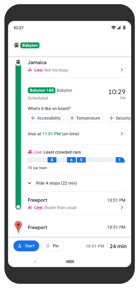
The new data is currently available in New York and Sydney. Google says more cities are coming soon.
Quick take: The drive to get people back into offices is making many public transport systems busy again. Crowdedness predictions can make the experience less painful, whether you’re worried about COVID or just hate jam-packed carriages.
Now I only need Google to sort out the subway‘s sweltering heat, high costs, constant delays, and horrible commuters, and I’ll gladly swap my bike for a trip underground.
Greetings Humanoids! Did you know we have a newsletter all about AI? You can subscribe to it right here.