
Apple’s WWDC 2024 keynote was quite a spectacle. It showed off a ton of new features coming to iOS 18, iPadOS 18, and macOS Sequoia, with most of it being powered with Apple Intelligence — Apple’s own brand of AI.
But there were some other non-AI features, too, including some much-needed changes to the iPhone’s home screen. It’s been a while since Apple really overhauled the home screen, the last time being iOS 14 and the ability to add widgets and create custom app icons through Shortcuts. With iOS 18, users can further customize their home screen with new ways to rearrange apps and widgets, plus the ability to theme app icons like never before.
Some may argue that these changes make iOS look more like Android, and that’s not what they want. But I disagree! iOS 18 means I can finally have some fun with my iPhone home screen, and I can’t wait.
Giving app icons a fresh new coat of paint

One of my favorite things about Android is how easy it is to customize the overall look and feel of your device. I particularly enjoy using Samsung’s Galaxy Themes system, which lets me apply an entirely new look in a few taps.
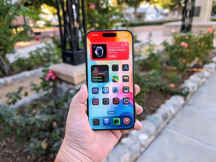
I’ve been wishing that Apple would have some kind of theme shop for iOS. While we didn’t get that in iOS 18, what we do have is just as exciting. In iOS 18, Apple has added new themes for your app icons — including Light, Dark, Automatic, and Tinted. Light is the “normal” look, Dark gives them a dark-mode-esque theme, Automatic cycles between these two depending on your iPhone’s dark mode settings, and Tinted allows you to make them whatever color you’d like.
I basically set my iPhone to dark mode 24/7. I have been using the same custom set of app icons for a few years now, which mostly have dark backgrounds with colorful icons and logos. But once I get my hands on iOS 18, I may just go back to default icons. Why? Because the dark mode default option looks pretty damn slick if I do say so myself.

It’s similar to what I’ve had with my custom icon set, and I like how the colors seem to pop, at least with Apple’s native apps. Of course, I do use third-party apps, too, so we’ll see how quickly those adapt to the new dark mode coloring.
Now, the tinting feature is a bit of a mixed bag. The examples that Apple has shown off aren’t the best. Some complaints from people online I’ve seen so far say that tinting icons results in low contrast, all tinted icons have a black background that not everyone wants, and it’s just not a good overall look.
Despite the flaws of changing the look of icons themselves, I think that it’s still great that we’re getting more ways to customize our iPhones. It may not be the same as getting a whole theme store like I would one day like to see, but giving users more choices is always welcome.
Another big change is how you can rearrange the apps and widgets on the home screen. While Apple still uses the grid format, you can now have empty spaces, columns, and rows between apps and widgets.
If this sounds familiar, it’s because Android has been able to do this for years. That’s right — iOS 18 will let you rearrange your icons and widgets however you damn well please. No more silly workarounds like creating a transparent space with an app just to put your digital squares where you want them.
I’ve kept my home screen layout the same for a few years now. I’ve kept it the same because I needed to have things at the top due to iOS limitations, plus I like quick access to my commonly used apps. But once iOS 18 is on my iPhone 15 Pro, I’ll be reworking my entire home screen.
I tend to keep my most-used apps toward the bottom, as it’s much easier to reach one-handed. With iOS 18, I’ll finally be able to utilize the bottom rows, eliminate unnecessary clutter, and show off my home screen wallpaper even more. The layout of the home screen offers a lot of possibilities, and I can’t wait to try it out myself and even get inspiration from others.
Finally, we can change the lock screen shortcuts

One thing I was pleasantly surprised with was Apple finally letting us change the lock screen shortcuts. For years, these shortcuts were locked to turning the flashlight on and off or launching the Camera app.
Now, with iOS 18, as part of the Control Center changes, we can finally change the shortcuts on the lock screen. The Control Center also has a new look, and users can put their favorite controls wherever they want. I also love that developers can now create controls for their apps for users to have in the Control Center or lock screen or even assign them to the Action button on the iPhone 15 Pro or iPhone 15 Pro Max.
More customization is always a good thing
 Christine Romero-Chan / Digital Trends
Again, Apple’s implementation of more customization may not be quite what I was hoping for. Maybe one day in the future we can have themes, right? I’ll keep my fingers crossed.
Still, I really like that Apple is giving us more choice to make our devices look more unique. Yes, it’s a feature that has been on Android handsets for years, but not everyone wants to use an Android phone. It’s been a long time coming, but Apple is finally giving its users more control over their phones.
Some people may not like the idea of iOS starting to look more like Android. But here’s the thing — no one is making you use any of these new features. They’re simply there if you want to use them. If not, that’s fine! And if you do, you’re about to have a field day.
Editors’ Recommendations
Services Marketplace – Listings, Bookings & Reviews