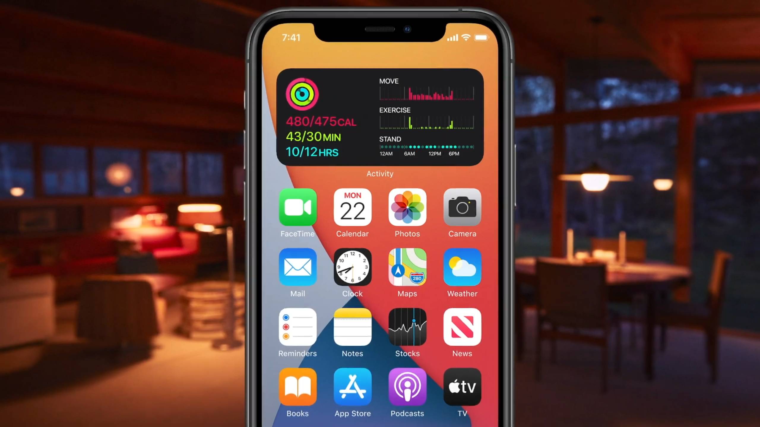
While I got an early look at iOS 14 thanks to a developer account, I didn’t have big expectations for the update. After all, how good can widgets be? After several weeks, I can confidently say that they’re fantastic – and this shows how low my Apple expectations really are.
Be honest: how many of the iOS 14 features introduced at WWDC 2020 did you scoff at after seeing them come out on Android years before? And yet, these creature comforts are streamlining my iOS experience in ways I that make it impossible to go back to iOS 13.
The widgets are the best example. I shouldn’t be so taken, but their clean look and helpful essential info shakes up how I look at my iPhone, reconfiguring how I’m using it for the first time since iOS added app folders.
I’m ashamed to admit how cheaply I’m bought. A small Weather widget with its background cloudy or bright according to the forecast and high/low temperatures gives me just enough info as I scroll. Same with my block of exercise info via the Fitness widget (I should get back out for a run) – and, favorite of all, the Batteries widget that briefs me on how charged up my devices are, which ends up looking like a dial-packed airplane dashboard.
I know all this info has been just a few swipes away for some time, but it’s a superior experience to have it laid out within my usual spread of apps – in the center of my swipeflow instead of at the extreme edges.
Sadly, you can only get widgets of first-party apps, which vary wildly in usefulness: I’m sure someone will be helped by a big block showing old photos, but I can’t fathom it. When we’ll get third-party app widgets after iOS 14 properly launches is unclear, and it honestly can’t come fast enough.

Why does this matter so much? It’s the first time iPhones have had something resembling multitasking – for there to be more going on in the screen than a single app. It’s tiresome to switch back and forth between apps, and a lot easier to scan info on the Home screen, though it’s not quite the same as manipulating two apps at the same time. With iPadOS finally enabling split-screen on iPads, it’s nice to get widgets as consolation prizes.
Laugh all you want, Android users – I know flagship non-iPhones have enjoyed that kind of functionality for some time. They haven’t had that Apple polish, though, and Android widgets come with some degree of fiddlesome execution that makes them work less efficiently than advertised.
Which is sort of the iOS user ethos in a nutshell – a defensiveness that insists the wait is worth it, or that the lack of this or that Android feature is less crucial than an iPhone’s ease of use. Some phone owners simply won’t experience things until they come to iOS.
For those users, there are other incremental upgrades that are definitely not going to convert any Android owners, but are welcome improvements. Incoming call alerts are relegated to a small notification bar instead of taking over the whole screen. And the App Library allows me to bury whole screens of apps I rarely use in favor of an auto-created shortlist of the ones I use most.
Heck, I’m even tickled by upgrades to the limp Weather app, which now has a much more robust info section – yes, please, I’d like to know how much humidity New York City will melt me with today – as well as a neat little rainfall timeline that only pops up when precipitation is on the forecast. Yes, I know, iOS users should just download Dark Sky already, but there’s something to be said for upgrades to core apps that many users won’t go beyond.
This is only the beginning of the beta series, and I’m looking forward to the tweaks Apple will make until we see the full iOS 14 launch later this year. But something tells me that folks who don’t need drastic operating system overhauls – who want ease, not change – are going to be pleased by how the few additions we’ve already seen in the iOS 14 beta will streamline how they use their iPhones.
