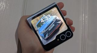
Samsung’s mid-year Galaxy Unpacked launch for 2024 was a bit dull. The Galaxy Watch range didn’t see many improvements bar the introduction of the Ultra (which is really only intended for the most diehard fitness heads), and time was mostly devoted to the show stopping Galaxy Ring, an entirely new product category for the smartphone maker (one that I’m excited for in Australia, where it is still yet to launch). Combined with an extremely lukewarm year for the sixth generation Samsung foldables, the Galaxy Z Flip 6 arguably received the least love of all the new gadgets – but I’ve come to appreciate the phone for what it is beyond the obvious gimmick.
The Galaxy Z Flip 6 has existed in a weird space among Samsung’s premium phone lineup for some time now. Vertically foldable akin to trendsetting phones of the 2000s, the Z Flip’s only real drawcard is in the name – it’s fashion before function. The Galaxy Z Fold 6 makes a much better case for its existence, acting as a tablet-phone hybrid, albeit at a high price point.
Internally, the phone underperforms compared to similarly priced models in the flagship Galaxy S product range, with a dimmer and less detailed screen along with a smaller body. Its unimpressive cameras don’t do it any favors and its battery life is middling at best.
But I don’t really want to be too down on the Galaxy Z Flip 6, because it’s an aesthetics first device – and it aces that. In fact, it’s more fun than almost every other phone I’ve used this year. The flipping function makes for a fun fidget toy and the phone can be placed in a bunch of creative poses.
But as it turns out, my favorite aspect isn’t actually that it folds – it’s the narrow portrait orientation that the form factor creates.
But why is that cool?

Perhaps it’s me admitting that smartphones are sort of blending together in my head, as they all share the same basic ‘big glass rectangle’ characteristic, but I’ve truly fallen in love with just how tall the screen of the Samsung Galaxy Z Flip 6 is.
The phone folds in on itself from top to bottom, and to avoid being too short for casual use in its folded form (where it’s square-shaped and usable in a limited capacity via the screen on the back) it has a taller stature.
Let’s pull up the specs: the dimensions of the Galaxy Z Flip 6 are 165.1 x 71.9 x 6.9 mm (H x W x D), while the Samsung Galaxy S24 (the phone with which it shares the most DNA) has dimensions of 147 x 70.6 x 7.6 mm. The Z Flip 6 has a slightly narrower (and thinner) chassis, with thicker bezels that give the S24 a great screen-to-body ratio.
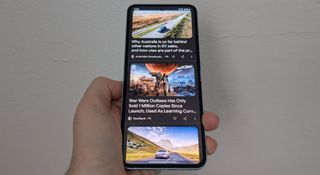
The 18mm taller screen on the Galaxy Z Flip 6 makes me wish we had more phones with zanier dimensions. That’s 18mm more for Google results to fill in Chrome, or for lines on a news article, or displaying more tweets, or for text in your messages, and while a lot of the extra space can be counteracted by the simple act of scrolling, I’ve been enjoying the longer display and the way content fills it from top to bottom.
Somehow it brings me back to the early iPhone years, when touchscreen phones were dramatically smaller and fake iPhone concept videos included completely absurd designs (particularly this one). It also takes me back to the early smartphone years when these gadgets were much more creatively designed, particularly models like the LG BL40.
Today you’re unlikely to find a smartphone smaller than six inches (excluding the 4.7 inch iPhone SE, which is likely to be defunct soon), with all dimensions getting a bump as the size goes up.
And that’s what we want, right? The uniformity of display dimensions across brands and manufacturers is informed by how we use the tech and the content we consume. It’s no coincidence that most streaming services cater content to a 16:9 aspect ratio with cinematic bars added in for a better viewing experience – it’s because smartphone use habits stem greatly from TV use.
Even more so than movies and TV shows, smartphones require display uniformity for the sake of app consistency. Some apps still have compatibility issues between tablet and smartphone versions, where on the tablet the app is scaled up to cater for the display size at the cost of image quality. If smartphone makers suddenly had to cater for vastly different aspect ratios from longer (or wider) smartphones, let alone simply bigger screens, the result would be greater pressure on developers and more unused dead space as developers try and hit the sweet spot of aspect ratios (letting the tops and bottoms of displays go to waste).
How far can a gimmick take the Z Flip 6?

It’s at this point that it’s worth discussing the inevitable – can Samsung continue to make the cool, quirky, yet stylish little foldable interesting enough to buyers?
There’s always going to be the space for consumers wanting something a bit more aesthetically pleasing, but in the vertical folding space, Samsung’s now competing with cheaper (and arguably better looking) options from Motorola and other smaller brands. Comparative to the Z Flip 5, the Flip 6 was less a revision and more a re-release with some small changes made.
It’s also a clash with reality to try and position the Z Flip 6 as an upmarket device, which is likely why we heard rumors of a cheap Flip FE earlier this year. The Flip isn’t meant to be a performance phone and the constraints of the display present a considerable obstacle to positioning it that way. So why not go down market with the FE, then?
For now though, I’m pretty satisfied with having a long phone. The taller screen meshes so well with my smartphone habits that I can’t help but love it. The folding aspect is cool too, and I’ve found a bunch of great uses and situations for it, but I’ve fallen for the display in a way not intended.
You might also like…
Services Marketplace – Listings, Bookings & Reviews
