I’ve fallen in love with my Xbox Series X. Whether it’s things like Game Pass or Quick Resume, the console has fast become a close companion. But there are two things it needs to truly thrive: more games and a media mode.
The first point is something we’ve covered before. For a myriad of reasons (read: the pandemic, supply chain issues, and the lifespan of previous consoles), we’ve yet to see many true AAA next-gen games appear on the Series X. This though, is already changing with titles like Flight Simulator and the upcoming Forza Horizon 5.
But something that could really drive the Series X and S upwards is a fully functional Xbox media mode.
What the hell is an Xbox media mode?
Let me explain. Since having the console, it has become my central point for content consumption. Any sort of video streaming, I now run through the device — as do the non-gamers in my household.
This shift of game consoles to entertainment centers isn’t new. It’s been happening since they put DVD players in the machines. However, I’d argue it hasn’t quite ‘clicked’ yet.
In many ways, a true next-gen experience is understanding that consoles like the Xbox Series X aren’t only for gaming aficionados. Instead, they should be designed as fully-fledged media units.
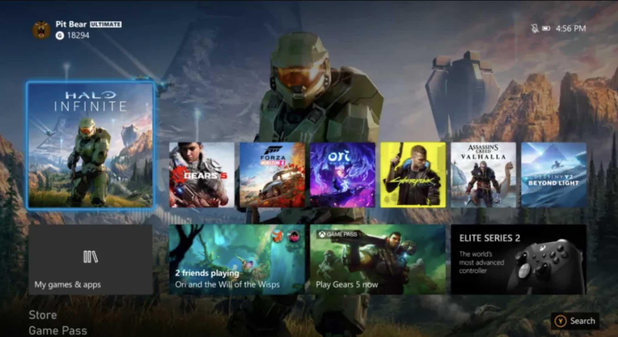
Here’s where we bump into an issue though: the console’s horrible UI.
Microsoft has done a terrible job with this confusing and garish interface. I get the logic behind the decision — it’s familiar to Windows and Xbox users, after all — but for the general public? It’s a damn nightmare.


I’m sure there are some of you that are fine with this, but I’d like to ask you two simple questions: are you a gamer? And are you generally tech-savvy?
If the answer is yes, a home screen like this will be acceptable — even if it is annoying you have to go through several clicks to find, say, a specific streaming app.
Thing is, there are rafts of people who find this shit off-putting at best and unusable at worst. And that’s why we need an Xbox media mode.
Suckle upon my mighty vision of a glorious, media mode future
Sure, Microsoft could just copy the PS5’s approach and have a tab dedicated to streaming apps, but this isn’t enough. Why use the wheel when you can invent an even better, wheelier wheel?
My idea is that elegant. When you turn on the Xbox with the official remote, it should you to a specific, minimal screen instead of the regular gaming interface from above.
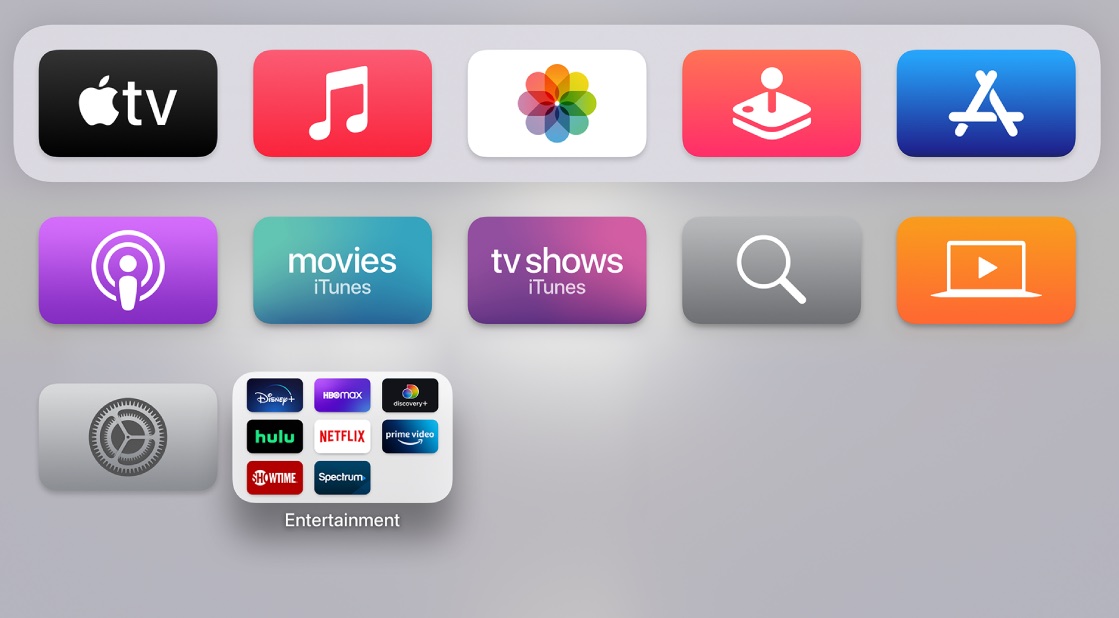
It doesn’t need to be complex, literally just an elegant list of streaming and media apps. Think of something like the Apple TV interface:


Indeed, you could make the Xbox media mode even simpler than this. A straight list of names and icons of streaming apps with an option to go back to the main screen.
At this point, some of you may be asking “WHY?” And I have a simple response to that.
Games consoles aren’t just for gaming. If you’re going to give space to this huge, computer-sized block in your house, why shouldn’t it function for everyone? Be a seamless machine for everyone?
On top of this, having an interface designed for non-gamers will help them get acquainted with the console, potentially turning them into people who actually want to use the machine, rather than just being intimidated by it.
How are we going to make this happen?
Well, I’m currently building a sacrificial wicker man in order to reach the Ghost of Gates. Hopefully, he’ll hear my frenzied prayers over the roar of the flames and give the Xbox the media mode it deserves.
If that doesn’t work, well, hopefully Microsoft will do it anyway. It’s not only good for its users, but may help it shift a few more consoles too.
Did you know we have a newsletter all about consumer tech? It’s called Plugged In – and you can subscribe to it right here.