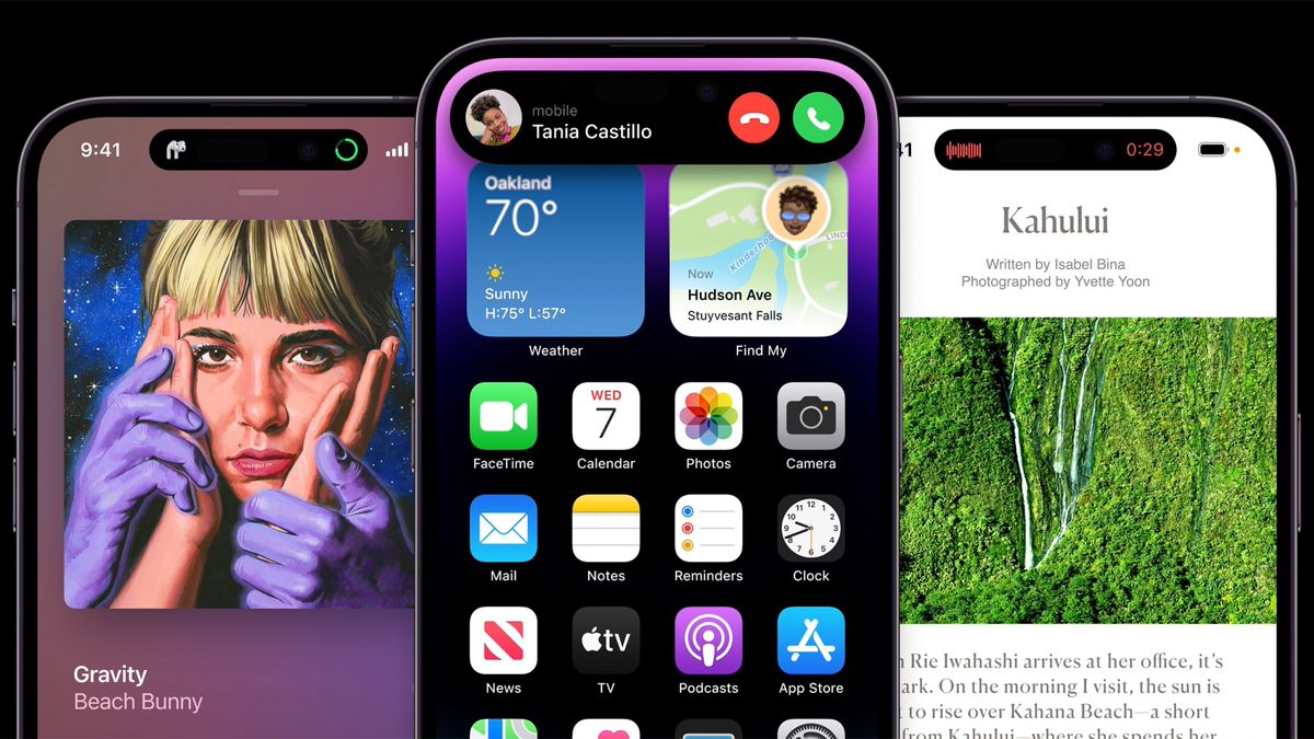
The new notch-busting Dynamic Island is one of the most eye-catching new features on the iPhone 14 Pro and iPhone 14 Pro Max – and while you won’t find it on the cheaper iPhone 14 and iPhone 14 Plus, it looks likely that the shape-shifting cut-out will appear on every iPhone 15 model.
That’s according to well-respected analyst Ross Young (opens in new tab) (via 9to5Mac (opens in new tab)), someone with a better reputation than most when it comes to predicting what Apple will do in the future – so we’re inclined to believe that this will indeed come to pass.
However, Young says that the other Pro display upgrades – the 120Hz refresh rate and the LTPO technology that enables the always-on display – are unlikely to make it to the iPhone 15 and the iPhone 15 Plus (if that is indeed what they’re called).
Life with the island
As enabled by iOS 16, the Dynamic Island expands and contracts around the physical holes for the selfie camera and forward-facing sensors: it can show information about media that’s currently playing, or incoming phone calls, and much more (you can even use it to play a game).
By comparison, the notch on the iPhone 14 and the iPhone 14 Plus, introduced with the iPhone X in 2017, feels a little bit tired by comparison. The old look also means less room on the status bar for icons and alerts too.
While the cheaper iPhone 15 models might be getting the Dynamic Island in 2023, Apple seems set on keeping a clear distinction between the Pro and non-Pro models. As with the iPhone 14 series, next year’s phones are expected to be split down the middle when it comes to the chipset running inside them.
Analysis: goodbye notch, hello island
It makes sense for Apple to extend the Dynamic Island feature to every iPhone model: it’s clearly the way the series is heading as cameras and sensors need smaller and smaller cut-outs, and it will add to the appeal of the iPhone 15 and iPhone 15 Plus.
We did hear about the pill-shaped and circular cut-outs ahead of time, but there weren’t any leaks around the Dynamic Island – showing that when it comes to in-house software development, Apple is still very good at keeping secrets from the wider world.
Ultimately, it’s just really cool – the way that the island shifts to show context-sensitive information that’s relevant to whatever you’re doing on the phone at the time. It’s like a smart, next-gen status and notification system really, and we’re all for it.
Expect Android phone makers to copy what Apple is doing here – indeed, the process has already started. Like the notch before it, the Dynamic Island could end up being a signature element in phone user interface design for a few years to come.
