As far as tablets go, keyboards fall in a rather weird class of accessories. For some, they are a must, while others don’t require anything more than taps, touch, and a bit of stylus action for both work and play. But that class also has its own schism. Can they live without a trackpad, or does their workflow make it to the finish line with a little assistance from touchscreen gestures?
But the rule isn’t universal. When you’ve got an iPad Pro in your hands, or even the significantly cheaper iPad Air with M-series silicon, you mean business. Or at least that was likely the intention when plunking over a thousand dollars on a tablet in hopes of getting some serious computing work done. For that kind of workflow, you need to get as close to a “real” keyboard — one that offers at least a half-decent trackpad.
Take one look at first-party options like the Magic Keyboard and an expensive realization dawns upon you. But not every option has to set you back roughly $300. Some cost just about $100 and still offer the best of both worlds with some clever use of technology. Think of turning the keycap surface into a trackpad. It sounds implausible, but it actually works!
This is the Mokibo Fusion 2.0

The cool accessory I am writing about is the Mokibo Fusion Keyboard 2.0, which has exploded past its crowdfunding goal on its Kickstarter project. The product is the brainchild of hardware experts scattered across the U.S. and Korea, and the founder is an LG veteran. But what really matters here is that Mokibo’s latest offering is arguably the coolest and most versatile keyboard out there for your iPad, Android slate, or computing machine.
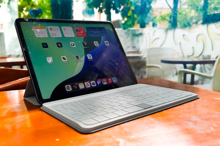
For now, I am keeping the focus locked on the iPad and using the compatible accessory for the 11-inch model, which costs just $89. That’s roughly four times lower than what you would pay for Apple’s fancy new Magic Keyboard and over twice as frugal as the Folio keyboard Apple has to offer.
The neat part about this keyboard is that it is size agnostic, which means you can comfortably pair it with iPads of any size without having to worry about the stand giving up. That’s no small feat. The far pricier Magic Keyboard that Apple now offers for the M4-generation iPad Pro has a weird rocking problem if you try to tap (or use stylus input) in the upper half of the screen.
Surprisingly good hardware

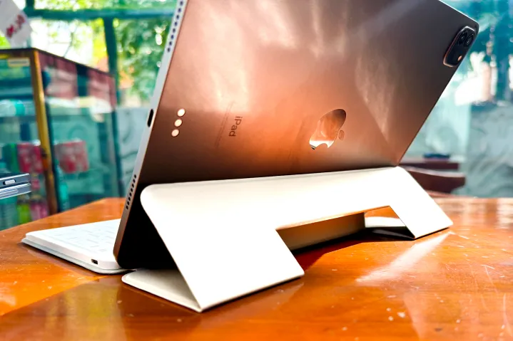
The build quality isn’t too bad either. It’s actually far from it, especially for what you are paying for the Mokibo accessory. The keyboard weighs just about 345 grams, which means you can comfortably slot it in your backpack without any added load. Plus, it’s quite slim, almost matching the thickness of the iPad Pro itself.
It’s pretty compact, roughly the same size as the 11-inch iPad Pro’s dominant edge. The material has a soft-touch rubberized feel to it, which again defies the keyboard’s asking price. Mokibo also sells versions that cover the entirety of an iPad’s rear shell and even offer a loop to keep the Apple Pencil in place for a modest premium.
On the basic version that I got, you get a rectangular cutout in the middle, which can be folded to create a makeshift stand for the iPad. Once again, it’s a non-invasive design touch with a functional purpose. There’s a USB-C port on the left for charging and a few LED lights atop the deck for mode change alerts.

The pairing process is seamless and doesn’t require any app. All you need to do is pair it once with your device, and it will automatically pick up the appropriate operating system keyboard setup. But if you have connected multiple devices — an iPad and a Windows PC simultaneously — all you need to do is hit a keyboard shortcut, and you will not only change the input mode but also switch the device with similar convenience.
Mokibo has even created LED color indicators for each operating system, including iPadOS, so you know which device is connected and what keyboards to execute. Talking about the keys, it’s somewhat of a mixed bag. The vertical depth is acceptable for a keyboard folio case.
However, the keycaps don’t have a depressed surface and they are quite smooth (for a purpose), which leads to some mistyping on a regular basis. But as you get used to the size and key spacing, the error frequency goes down. It’s certainly a test of patience, but the rewards come soon.
What makes Mokibo’s keyboard special

Now, let’s talk about the real draw to the Mokibo keyboard: the touchpad integrated into the keycap surface. It stretches from the return key on the right and to the caps lock key alongside the left edge. And it works! For the most part. There’s a bit of an asterisk situation here, one that depends squarely on how much a trackpad is embedded in your workflow.
You see, the trackpad gets the job done — as in, 90% of the time. The usual single-finger clicks and movements work just fine. You only run into the occasional failure when performing three-finger gestures to launch the multi-task view or minimize landing on the home screen.
That primarily has to do with the vertical space available for performing the usual grap-and-drop movement with multi-finger gestures. The Fusion 2.0 keyboard will also trouble you if you are performing a task where grab-and-drag movements are required, like cropping an image and double-click select for text items on the screen.
The aforementioned woes partially have to do with iPadOS’ odd way of cursor-based interactions, which is quite vexing if you are expecting it to work the same way as macOS or Windows. But if you are looking at interactions like double-click, single tap, or basic scrolling, the Mokibo keyboard is a smooth-sailing journey. Here’s a short clip that captures the hits and misses:
You also need to be careful because accidentally grazing past a key that you intend to press will move the cursor to some other portion of the screen. This is not much of a concern for everyday tasks, but while editing a document, it often lands the cursor in unexpected places, and you end up making changes at unintended places. In a nutshell, keep your eyes and fingerprints a tad more vigilant than usual.
There’s another crucial benefit here that’s easy to overlook, irrespective of the device it is paired with. This trackpad is massive, much bigger than any keyboard accessory out there, and in the same league as some laptops that are getting overzealous with the size of the touchpad these days. On the Fusion 2.0, Mokibo says the touchpad covers nearly 76% of the deck.
For some, Mokibo’s iteration of touchpad-atop-keycaps is a solution looking for a problem. For example, you need to be careful because accidentally grazing past a key that you intend to press will move the cursor to some other portion of the screen. This is not much of a concern for everyday tasks, but there are some realistic scenarios where it can quickly get irksome.

Thankfully, there’s a solution to it all. Just imagine your Mokibo keyboard doesn’t ship with a fancy touchpad solution. Now, hit the Fn + Caps Lock feature to physically disable the touch-sensitive area.
Here, I also want to point out that the touchpad is divided into two halves, depending on whether you prefer it in the left or right half. You can switch between either. However, it’s not a hard rule, and that’s for a reason. For example, if you are moving the blinking cursor in a text editor, you will quickly run out of vertical space to get the cursor from one end of a line to the other.
In such scenarios, the touchpad automatically expands the sensing area. For example, if you have enabled the left-zone touchpad and graze past the halfway mark, the other half will seamlessly respond to your finger movements. Or, as they say, business as usual. But there are a few more unexpected benefits here.

For added flexibility, there’s a mechanical option available if you are not sure if gently tapping on a touch-sensitive keyboard will work. Mokibo has divided the space bar and put a physical select button in the middle of it. This button serves as the physical left button on an average mouse or trackpad.
It’s somewhat odd, and there is definitely a bit of a learning curve here because this button is multi-functional. For example, when typing in Apple Notes or Google Docs, pressing the button automatically deduces that you want to enter a space command instead of selecting a word.
Over time, both my thumbs have grown used to clicking each half of the space bar while developing muscle memory to not click on the multifunction key. Nonetheless, it’s not what you would expect from an average keyboard accessory, but I guess that’s the innovation tax you must pay here.

Mokibo also deserves praise for making the shift between touch and type fairly seamless and, most importantly, far less error-prone than I had expected. It’s not perfect, though, and depending on the kind of keyboards one is used to, the experience can range from anything between “OK” to “what the hell.”
To its credit, the company has reimagined some of the function keys. For example, you get quick controls for shutting off the camera feed and switching between the operating modes.
Should you get this for your iPad?

That brings us to the final destination: Should you buy the Mokibo Fusion 2.0 keyboard?
That depends on how you approach a $89 keyboard folio accessory for your iPad. Want to get a taste of cutting-edge input technology without having to spend a fortune? This one is for you. Do you miss the lack of a touchpad for basic UX interactions on your keyboard accessory? The Fusion 2.0 could just be the solution you are looking for.
The Mokibo Fusion 2.0 keyboard is not a magical solution. It’s more of a stopgap solution that offers the best of both worlds, with a side-serving of the caveats that come with any experimental tech.
Editors’ Recommendations
Services Marketplace – Listings, Bookings & Reviews
