While we continue to wait for Wear OS 3 to make a substantial impact on smartwatches, Xiaomi has gone its own way with the Xiaomi Watch S1 Pro and used its own in-house-designed operating system.
As it turns out, Xiaomi’s software can teach Wear OS a few things about what makes an engaging, useful, and user-friendly smartwatch. I compared it to the Google Pixel Watch to illustrate where Google is still going wrong.
Why Xiaomi’s software works so well
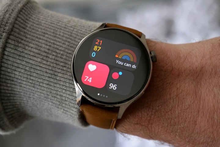
The Xiaomi Watch S1 Pro uses MIUI Watch OS 1.0, and it’s apparently based on the MIUI interface the company uses on its smartphones, although I don’t really see much connection. The Google Pixel Watch has Wear OS 3.5, the latest version of the refreshed software introduced in 2021. Both use variations on the same tile-based theme, where you swipe across the screen to access different features and information. It’s an established way of interacting with a smartwatch.
What does Xiaomi do differently? It uses widgets on each “tile” when you swipe across the screen, giving you more information on a single screen, and providing large, obvious places to tap so you can find out more. It sounds like it shouldn’t make much of a difference, but it genuinely does, and it’s a far more effective use of space than one tile showing data from a single source.
Key to the software’s success is the ease with which the widgets can be customized and grouped by theme. For example, one screen can show your daily activity, heart rate, and blood oxygen levels. Tap any one of the widgets, and you can get more in-depth detail. If all you want is the basics, it’s available at a glance with a single swipe away from the watch face. There are multiple options for each tile, giving you plenty of scope for personalization.
What’s so bad about Wear OS?
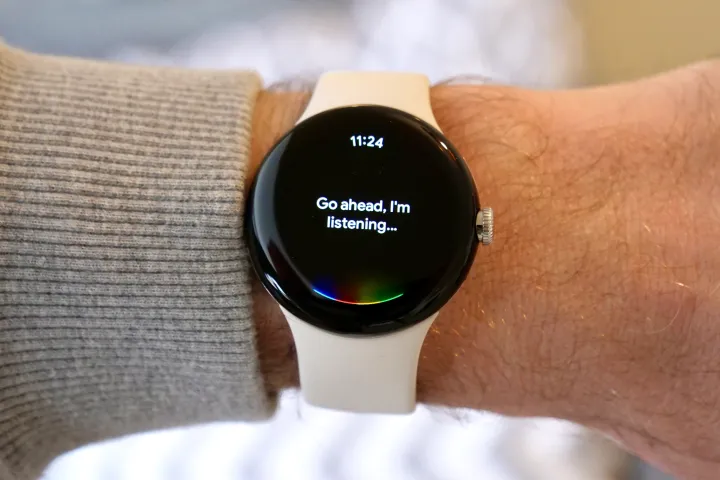
How different is this compared to Wear OS on the Pixel Watch? On Wear OS, each tile shows one specific piece of information, and while the order can be changed, you can’t add to the data shown on each one. The Pixel Watch uses Fitbit to display its activity data and displays it through a single tile. You can dig into the data, which is shown in one long list, complete with tiny text, or swipe to go to another tile for your heart rate.
There isn’t a specific blood oxygen tile, but the data is available when you explore the daily activity tile. This is a big part of the problem because I don’t really want to explore anything on a smartwatch screen. I’d like to see the data I want quickly and easily — and not have to tap, scroll, and squint at the screen. I also don’t want to reach for my phone, as this defeats the objective of using a smartwatch in the first place.
The simple, fast customization of the interactive, live widgets in MIUI Watch OS makes this possible. It’s also controlled through one app, Mi Fitness, rather than requiring both the Pixel Watch and the Fitbit app — and even the Fitbit ECG app if you want to enable that function too.
Confusingly, Wear OS 3 on the Pixel Watch is both basic and too complex, yet still can’t manage to provide key, live information in a way that’s quick and easy to view.
Wear OS is still supreme in certain areas
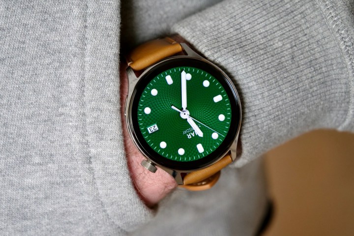
Does this make the Xiaomi Watch S1 Pro better all-around than the Pixel Watch? No, it’s not all good news for MIUI Watch, and there is still plenty that the Pixel Watch does better. The fact that neither smartwatch gets everything right shows how far Android-based models are from matching — let alone beating — the Apple Watch.
Setting up the Xiaomi Watch S1 Pro is a laborious process. The QR code refuses to scan, and you have to change various settings buried on your phone for the smartwatch to work correctly, even if you connect it to a Xiaomi phone. The Pixel Watch connects more quickly, with much less effort, regardless of what Android phone you use. The choice of colors and overall look of Wear OS is more mature than MIUI Watch OS, plus most of the animations are smoother, and the haptics are much more tactile too.
Another major difference is the way each smartwatch handles notifications. Most of the time, the Pixel Watch gives you the option to show the full notification on your wrist, while the Watch S1 Pro shows a card and prompts you to open the app on your phone to see more. This varies depending on the app, but MIUI Watch OS is notably worse than Wear OS here, and it can make the smartwatch less useful if you rely on it to monitor notifications.
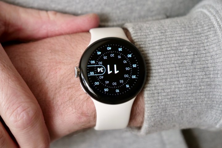
I’m indifferent about the choice of a scrolling main menu on the Pixel Watch, or Xiaomi’s WatchOS-style icons, but quickly became tired of the Pixel Watch’s small screen and even tinier viewing area. The Xiaomi Watch S1 Pro’s bigger screen shows so much more information, and it’s all much quicker to access and read, which makes it a less frustrating experience to use. This even applies to the way information is displayed when working out, with larger, more obvious text making data more glanceable than on the Pixel Watch.
Is Xiaomi’s watch better than the Pixel Watch?
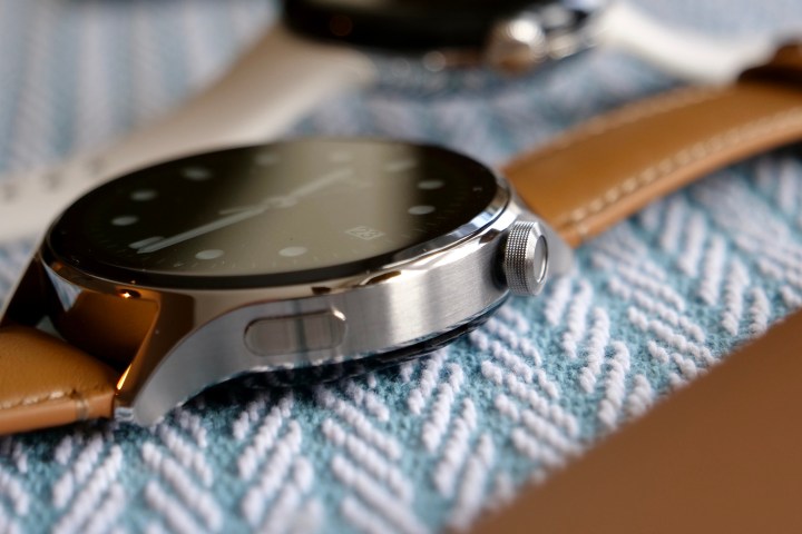
Does all this mean you should buy the Xiaomi Watch S1 Pro over the Google Pixel Watch? They aren’t too removed from each other in price, as it’s possible to find the Pixel Watch for around 300 British pounds, which is the same as the Xiaomi smartwatch. But the S1 Pro isn’t officially available in the U.S., where the Pixel Watch costs $349.
It’s actually a surprisingly difficult question to answer. The Pixel Watch should be the flagship, default choice for Android phone owners wanting a smartwatch, but its various flaws outside the software mean it isn’t. The Xiaomi Watch S1 Pro is more annoying to set up, doesn’t run apps, doesn’t come with LTE, and doesn’t include Google services like Google Assistant (it has Amazon Alexa instead) or Google Maps.
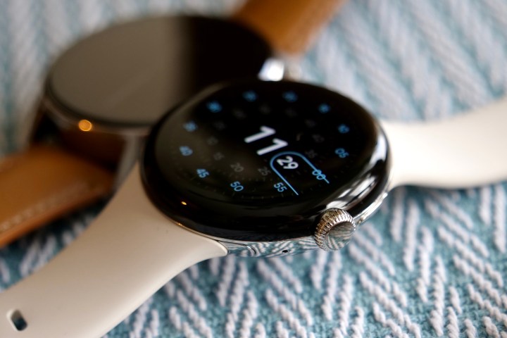
Neither is perfect, but one thing is for sure — Xiaomi has nailed the software user experience compared to Google, and this is somewhat surprising given Google’s resources and history.
For all its years of trying, and hopes that Wear OS 3 would change its wearable fortunes, it’s shocking that other smartwatch makers (add Samsung and Huawei to the list of “companies doing it better,” along with Xiaomi) still better understand what makes a successful smartwatch operating system than Google.
After this comparison, if you’re none the wiser about which smartwatch to buy for your Android phone, the Samsung Galaxy Watch 5 is still the wisest choice.
Editors’ Recommendations
Services Marketplace – Listings, Bookings & Reviews