Did you know we have an online conference about product design coming up? SPRINT will cover how designers and product owners can stay ahead of the curve in these unprecedented times.
The digital design industry is maturing. With established best practices and the advent of design systems, it is now possible to strive for a longer design life for the products we create. We can aim for digital classics instead of one-hit wonders.
Industrial design is the poster child of longevity. The timeless charm of a Vespa scooter. The iconic contours of a Coca-Cola bottle. The elegant angles of an Eames lounge chair. Will there ever be a digital design equivalent to the ageless wonders of the industrial design world? Can a user interface endure the decades like a Leica camera?
Unlikely, it seems to be the answer. Physical objects, once built, don’t need to renew domain names or keep up with web standards in order to exist. Timeless design must be built on a timeless foundation, but digital is always shifting.
The shelf life of digital designs can be extended, however. Even while the underlying technology continues to evolve.

Aim for timeless design
It is no surprise that design systems are exploding in popularity. A carefully crafted design system gives even the most rapidly evolving product a clear set of timeless principles. UI components may change with time, but the feel of the product can remain consistent over many years, even as the product matures. Flexibility and longevity. That’s a win-win.
Read: [Solutions, not art: The true business value of design]
Candidates for the digital design hall of fame
Longevity in digital design isn’t a pipe dream. It’s our present reality, and as others have shown, it’s possible for interfaces to age like fine wine.
Google’s Material Design (2014)
The advent of Material Design marked a turning point in digital design. For the first time, a major player like Google created a design language from scratch. Not only that, it empowered designers by providing guidelines and tools to implement the language in their own work.

Inspired by paper, Material Design revolutionized the way we think about design for the digital world. By borrowing characteristics of the physical world, like shadows and age-old animation principles, Material Design builds on familiar visual cues without spinning up GPU fans. No longer are we replicating leather textures or hyper-realistic reflections that cause browser tabs to grind to a halt.
Takeaway: The physical world can influence digital design, but it needs to adapt to the characteristics of the underlying technology.
GOV.UK (2013)
Featuring its own comprehensive design system, GOV.UK was among the first user-centered government websites, and it put accessibility and information design on the map.

Bland, some might say, but the design team never aimed for aesthetics. Instead, the focus was information design: Give users the information they need to complete tasks in minimal time. No frills, no fuss. Such radical simplicity made GOV.UK an instant classic.
Takeaway: User interfaces don’t have to be pretty to be successful.
iOS 7 (2013)
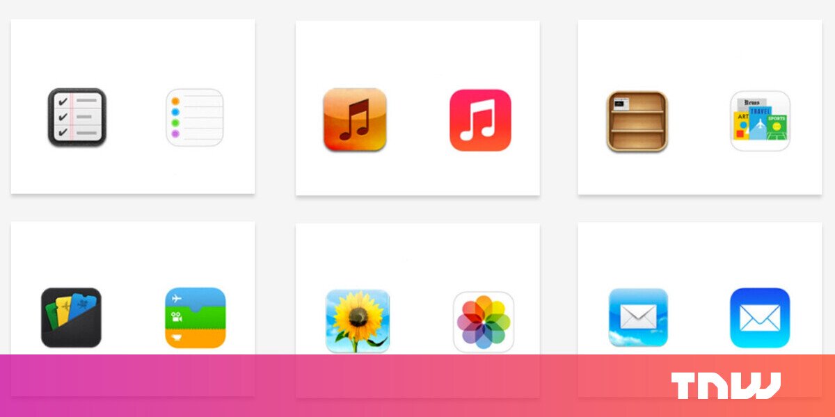
The original iOS from 2007 deserves its own entry, but it wasn’t until iOS 7 that Apple waved goodbye to skeuomorphism and embraced flat design. Farewell, wood grains. Hello, stunning simplicity. iOS grew up.
To be fair, Android led the way with its implementation of flat design and arguably featured better animation. However, Apple caught up and created a digital design aesthetic that was later extended to both the Mac and iPad operating systems.
Apple didn’t totally abandon skeuomorphic effects in iOS 7. The notes app still features a subtle paper texture, and the weather app updates the background to reflect daylight and weather conditions. However, the 2D interface is no longer forced to be something it’s not.
Takeaway: Flat design is king for 2D user interfaces.
Trello (2011)
Not counting usability improvements, the Swiss Army Knife of digital apps has barely changed in almost a decade. While competing products sprang up promising “all the features,” Trello stood its ground and remained popular because of its simplicity.

Instead of overloading on features, Trello offered a plugin ecosystem that could meet the niche needs of some users without crowding the UI for the majority. Trello is a poster child of the 80/20 rule in design (a.k.a. “The Pareto Principle”).
Takeaway: Iterate carefully and apply the 80/20 rule.
Google Chrome (2008)
If Volkswagen’s tagline is “Das Auto,” then Chrome’s should be “The Web Browser.” Google took a typical web browser, removed everything that was not essential, made it incredibly performant, and overtook the market.

Google’s major contribution here was making performance a must-have for all digital products going forward. The understanding of hardware and browser limitations, and striving for that silky smooth 60fps, is what makes digital design fundamentally different from print or industrial design. Chrome’s success is a testament to the importance of performance for great user experience.
Takeaway: Simplicity and performance alone can win in the long run.
Basecamp (2003)
Basecamp made its name by going against the Silicon Valley dogma of venture capital funding, exponential growth, and early exits. Their dedication to sustainable, long-term products is reflected in the design of Basecamp 3.
Designers can help create products that stand the test of time, but they are powerless if CEOs don’t appreciate products that are designed to age gracefully. Among today’s makers of digital products, it’s rare to find companies that practice careful decision-making or refuse to chase after every new trend. Basecamp is an exception.
Takeaway: Sustainable businesses make for sustainable products.

Google (1998)
Looking back at the first iterations of the Google homepage, it took roughly a year to create the iconic layout that is now globally recognized and usable without fail.
Google’s homepage is a rare digital product where someone from the end of the 20th century could be teleported to the present day, interact with the UI, and not even notice what has changed.
Takeaway: Great products can evolve, rather than reinvent, and still maintain their market lead position.

2001: A Space Odyssey (1968)
Stanley Kubrick’s masterpiece was equal parts Hollywood movie and futuristic vision. Predictions of the future are usually skewed by the present, resulting in corny ideas that seem comical in hindsight. It is remarkable how outside the box the concepts were in 2001: A Space Odyssey, like the prediction of touch screen displays, iPad-like tablets, and voice-controlled interfaces.

Astonishingly, the UI designs still look relevant even though it would be another five years before Xerox PARC would begin experimenting with the first iterations of a graphic user interface, tests that would later form the basis of both Microsoft and Apple’s operating systems.

The film’s concept interfaces featured something akin to a flat design aesthetic. It took another four decades until Apple ditched skeuomorphism and followed suit. Whether deliberate foresight or a limitation of the graphics capabilities at the time, the glimpses of the interfaces ring authentic to this day.
Takeaway: Stanley Kubrick is a genius.
Principles for enduring digital design
No formalized principles exist for creating “timeless” digital interfaces, not surprising in an industry run on the motto of “move fast and break things.” But if there were guiding principles, they ought to be universal, tech-adaptive, simple, and pragmatic.
Universality
One way to encourage the long-term survival of digital products is to make them usable by the widest audience possible. This means designing for accessibility, performance, and inclusiveness. As products become more widely adopted, multilingual experiences should be offered.
Tech-adaptive
Rather than forcing creative visions upon underlying technology, tech-adaptive design works in collaboration with the underlying technology. In web design, this means forgoing animations that drop frame rates to 10fps or not recreating physical surfaces in HTML, CSS, and JS.
No-nonsense simple
This is not to say that longevity requires products to be dumbed down or limited to a certain number of features. It does, however, mean that features are chosen deliberately and with the holistic experience in mind. Apply the 80/20 rule and err on the side of simplicity when in doubt.
Pragmatic
Digital designs have much in common with plants in terms of longevity. Like plants, they need to be constantly watered in order to survive. If Google were to go bankrupt and close, its products would close with it. Not true for physical products. A car made by a company that no longer exists in a country that no longer exists can still be used if it is well maintained. Industrial designers can be sure that their work will outlive them. Not so for digital designers.
Furthermore, many startups are in survival mode. They don’t have the resources to explore how to add extra years of life to their interfaces. More often than not, digital designers will see their work perish before they see it age.
In such circumstances, longevity isn’t the first, second, or even fifth priority of digital product design. Products must make it through their first few years of existence before they can worry about aging well.
But small decisions can set products on the right track. When there’s ample time, create a consistent design system. When time is short, extend or customize existing systems. Follow best practices. Apply the 80/20 principle. These are small ways in which digital design may be nudged toward longevity, even in fast-paced, high-pressure environments.
Design for longevity
Digital designers would be wise to recognize the value of creating work that maintains relevancy for years to come. Maybe instead of obsessing over the latest trends, the industry ought to applaud work that has stood the test of time.
User interfaces may never hold the nostalgic charm of a rugged, old Vespa scooter, but digital products can still improve lives. The longer they do, the more likely they are to leave a legacy that lasts for decades to come.
The Toptal Design Blog is a hub for advanced design studies by professional designers in the Toptal network on all facets of digital design, ranging from detailed design tutorials to in-depth coverage of new design trends, tools, and techniques. You can read the original piece written by Damir Kotorić here. Follow the Toptal Design Blog on Twitter, Dribbble, Behance, LinkedIn, Facebook, and Instagram.
Corona coverage
Read our daily coverage on how the tech industry is responding to the coronavirus and subscribe to our weekly newsletter Coronavirus in Context.
For tips and tricks on working remotely, check out our Growth Quarters articles here or follow us on Twitter.

