At WWDC, Apple announced that the next macOS will be called — drumroll please — Big Sur!
This is obviously interesting news in itself, but the biggest update all revolves around the design of the new macOS.
Having watched the keynote, there’s no doubt that with Big Sur, Apple is bringing macOS ever closer to iOS and iPadOS.
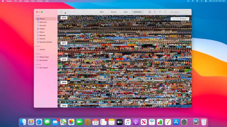
One of the most obvious updates has been the redesign of many of Apple‘s famous icons, including things like Finder and Garageband. Another change is going to be the dock, which has had a subtle update.
You can see an example of this below, plus the new aesthetic design, and some of the aforementioned fresh logos in Big Sur:

It’s not just the logos of the apps that have been revamped. Finder, Mail, and Photos (pictured above) are three examples that’ll have new features and offer a far more sophisticated experience to users.
Effectively, these all look very similar to the updates that we’ve seen on iPadOS 14.
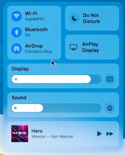
This movement to a more iOS-esque design can be seen most clearly in the introduction of Control Center to macOS Big Sur.

You can access this by clicking on the top right-hand side of your computer. This menu is also customizable, meaning you’ll be able add the settings you most desire into the Big Sur Control Center.
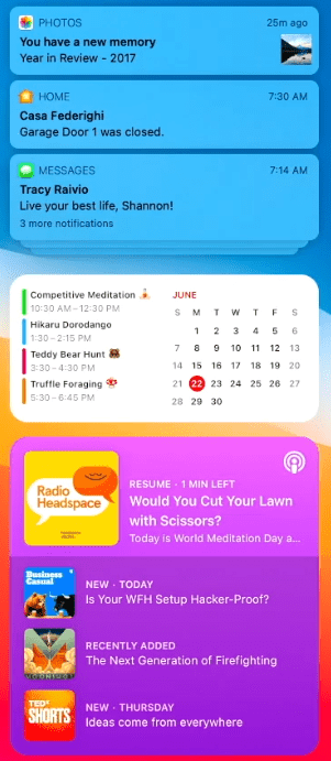
On top of this, the new macOS will also redesign Notification Center. Have a little look at this:

As you can see, it’s been altered into a single view and the notifications have been grouped properly — which is far better than the current experience on macOS.
And, finally, another element that further cements the increasing connection between Apple’s mobile and desktop operating systems is the introduction of iOS widgets into macOS Big Sur.
These will be the same widgets that appear on the iPhone and iPad — something I’m excited to give a spin on my MacBook.
Anyway, it appears that the gap between Apple’s operating systems are getting smaller and smaller. Time will tell how much of that is a good thing, but I’m intrigued to see where this goes.
For more gear, gadget, and hardware news and reviews, follow Plugged on Twitter and Flipboard.
Published June 22, 2020 — 18:44 UTC
